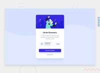
Design comparison
Solution retrospective
I would like to accept your suggestion to enhance my frontend knowledge. Could I have some suggestion? Sorry for the language incompetence.
Community feedback
- @afrusselPosted about 3 years ago
Good work. There is some width and height mismatch on the card. I would like to request you please take a look at my solution it may help you to find your issues
Marked as helpful1@SArkar-HtetPosted about 3 years ago@afrussel Thanks for your suggestion. I updated my solution according to your suggestion.
0 - @ayushsh841Posted about 3 years ago
Hey Sarkar,
You could align the content to the centre as on higher resolutions the component sticks to the top. Also would suggest using another div to wrap the contents of main so that it is easy to manage the content.
Marked as helpful0@SArkar-HtetPosted about 3 years ago@ayushsh841, I resolved this issue. Thanks for your suggestion.
0
Please log in to post a comment
Log in with GitHubJoin our Discord community
Join thousands of Frontend Mentor community members taking the challenges, sharing resources, helping each other, and chatting about all things front-end!
Join our Discord

