Design comparison
SolutionDesign
Community feedback
- @AdrianX19Posted almost 3 years ago
Hi @rolando-17
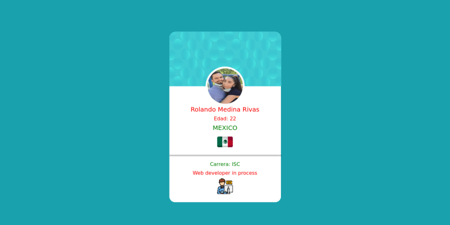
Great to see some creativity over here! :)) Congrats on submitting the challenge! Just a few suggestions:
- try to use semantic tags when it's possible, in your case you could for example change the container <div> to <main>
- don't use headings for styling, always start with <h1> and if you need to change how it looks that's where you can use your CSS powers! also not everything should be a heading - there is also <p> tag that can come useful
- your dividing line is too thick I would say and I would suggest using border in this case instead of a <hr> element
- the card background pattern as well as dividing line are sticking out from outside the card a bit, try to play around with width and maybe try using some relative values instead of absolute ones
- you're missing pattern in the main background and the font family is not the one required by design
Hope the feedback helps you a bit! Have a good day
Marked as helpful1 - @rolando-17Posted almost 3 years ago
Thanks for the suggestions i will use your suggestions on future proyects
1
Please log in to post a comment
Log in with GitHubJoin our Discord community
Join thousands of Frontend Mentor community members taking the challenges, sharing resources, helping each other, and chatting about all things front-end!
Join our Discord
