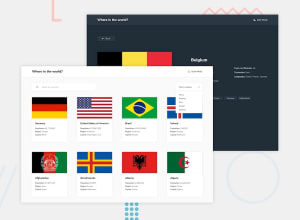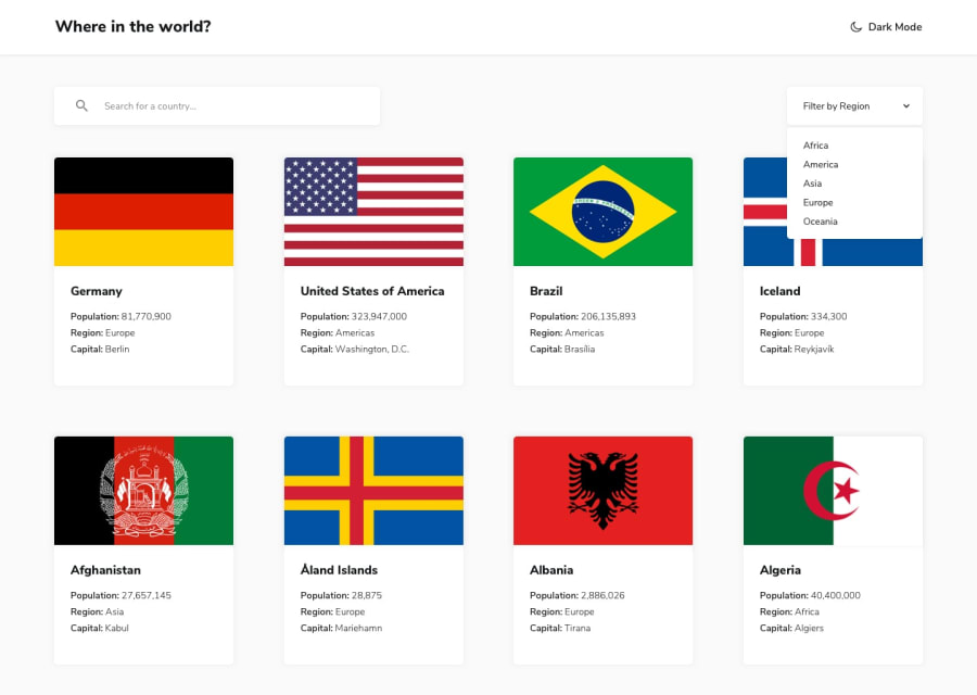
Built with Vanilla JavaScript, Webpack 5, Sass, PostCSS and Babel
Design comparison
Solution retrospective
Hi everyone!
Welcome to my solution to this challenge! I built this solution with purposely with Vanilla JS on an MVC architecture with Webpack 5 and not with React or any other SPA framework... I would love to have any feedback about my code, the built-up of the project or how good/bad I managed to implement this :) Thanks all!
Community feedback
- @michey85Posted about 3 years ago
Good job, man! I like this nice transition between themes. Maybe you should work with margins on Details page, add some space between moon icon and theme text and work on selector (of course it's always most difficult part with the form). I made the same project with React, so I can imagine how much it took from you with vanilla.
Marked as helpful0@androgitaiPosted about 3 years ago@michey85 Thanks for the feedback! Glad you like it :) Yeah the selector is just a html selector for now I'm planning to do a custom ;) When you say margins on details page what part do you mean exactly? Thanks!
0@michey85Posted about 3 years ago@androgitai On the desktop between Back button and other content. Actualluy it's because of the button - 5rem for margin-bottom it's too much I think, especially width additional paddint-top for the content area.
0
Please log in to post a comment
Log in with GitHubJoin our Discord community
Join thousands of Frontend Mentor community members taking the challenges, sharing resources, helping each other, and chatting about all things front-end!
Join our Discord
