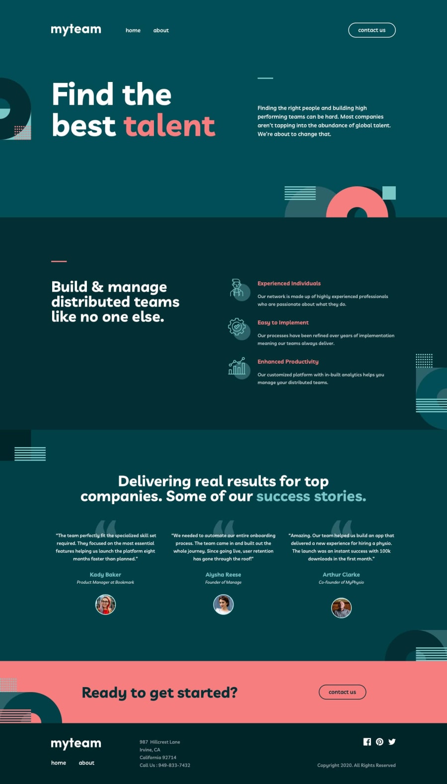
Design comparison
Community feedback
- @mattstuddertPosted over 4 years ago
Awesome work on this challenge, Waseem. You've done a really good job and your solution looks great. How did you get on with the challenge? Learn anything new while building it?
One small thing: the team member information wasn't showing up when I clicked the
+icons. Also, there are a few accessibility & HTML validation errors that it would be worth trying to resolve.I hope you enjoyed the challenge. Keep it up! 👍
0@codewaseemPosted over 4 years ago@mattstuddert Thanks for your feedback, Matt. Yes, I'm constantly learning and discovering new things as I work on these challenges.
I got busy with some other work and didn't get time to work on showing up the team member's information. After that, I totally forgot about it. Thanks for the reminder.
I figuring out how to fix those HTML validation errors as they are generated by Gatsby and I have no control over it.
1
Please log in to post a comment
Log in with GitHubJoin our Discord community
Join thousands of Frontend Mentor community members taking the challenges, sharing resources, helping each other, and chatting about all things front-end!
Join our Discord
