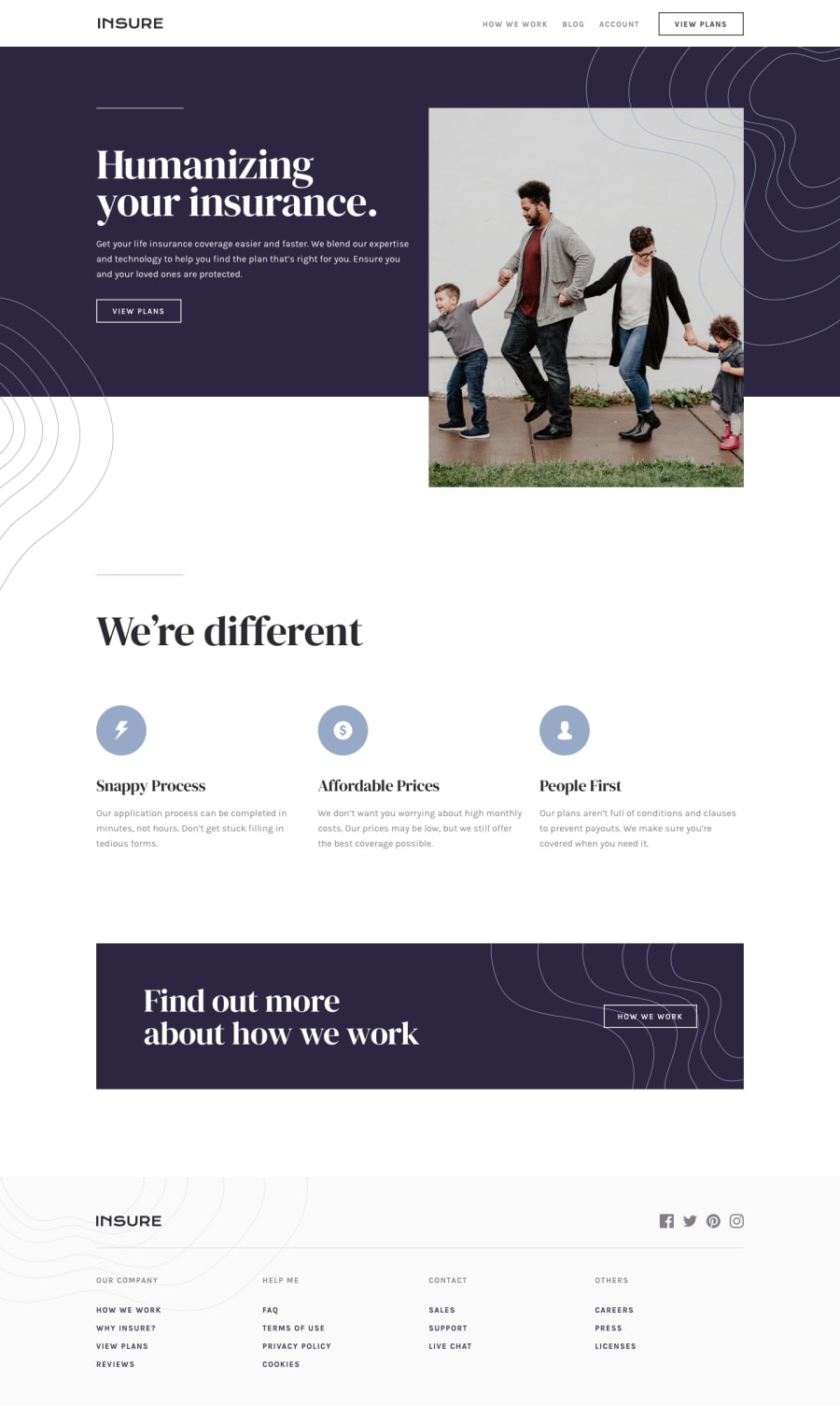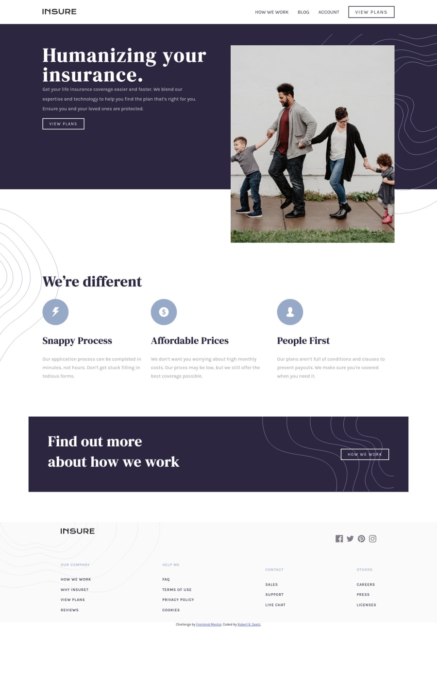
Built with HTML5, CSS3, Flexbox, Responsive Design, Vanilla JS
Design comparison
Solution retrospective
I had finished this project, but I wasn't satisfied with the results. I found a 2 1/2-hour live code video of this project on YouTube by Florin Pop, and started over from scratch. For anyone else who is finding this project a challenge, I suggest you watch at least part of this video. The URL is https://www.youtube.com/watch?v=9HVKR_hK0nY&t=7659s
I have written a fairly detailed README, which can be found on my GitHub repo, explaining my challenges and how I was able to solve them. One issue I'm having with the README is that my screenshots aren't displaying. I would appreciate it very much if someone could tell me what I'm doing wrong.
Another issue I'm having with all of my projects is with SVGs. I have not been able to figure out how to add hover effects, such as changing the color of social media icons when hovering over them, or changing colors in general. I would appreciate any help anyone can offer. Any other constructive feedback would also be very much appreciated. Thank you!
Community feedback
- @manojks092Posted about 3 years ago
Hey Robert, first of all really good work and i appreciate your efforts: -For the hover effect you can use CSS3 with
pseudo-classes
which is used to style the element based on its state. Or you can use javascript on that element as well with events or event handlers. Depends on what you're comfortable with, but in my opinion using CSS3 would be easier as sometimes if Javascript failed to load still your hover effect will work.-For the screenshot to be appeared in the github repo kindly check whether you've uploaded design images or design folder(this folder comes in the zip file that you've downloaded for the particular project). Once you create folder named 'design' in your main github repo, and upload the images, you'll see the screenshot of the image in the readme.
-In your solution the page is overflowing on size 735px and lesser, you're showing modal but that modal is overflowing. Kindly look over the code once again. Hope it'll be helpful. Happy Coding.
Marked as helpful1@rspatzPosted about 3 years ago@manojks092 Hi Manoj, I apologize for not responding sooner! I didn't realize anyone had responded, and I'm literally working night and day building projects and looking for a job. Thank you very much for the encouraging words, and for all the helpful suggestions! Another problem I appear to be having with all of my projects is that the mobile navigation is loading up with the menu already open, rather than collapsed with the hamburger displayed. I suspect I'm missing some JS code, but I'm not sure where. Thank you again for all the help! Robert
0@manojks092Posted about 3 years ago@rspatz Hey Robert, i couldn't answer immediately hope you wont mind, well the issue that the menu is already open you need to set the
nav ul.show to display: none
and then again create another class for the same element,nav ul.show.disclose and set it to display: block
and then toggle it in JS, your issue will be resolved, i hope im clear, but if its not i'm commenting on your github repository you can see whether my updated code work for you. Hope it'll be helpful. Happy Coding :DMarked as helpful1 - @manojks092Posted about 3 years ago
Kindly update your js code in github repository. Else the menu wont appear. Thanks
0
Please log in to post a comment
Log in with GitHubJoin our Discord community
Join thousands of Frontend Mentor community members taking the challenges, sharing resources, helping each other, and chatting about all things front-end!
Join our Discord