Design comparison
Solution retrospective
Hi All,
Let me know what you think about my solution.
Community feedback
- @pikapikamartPosted over 3 years ago
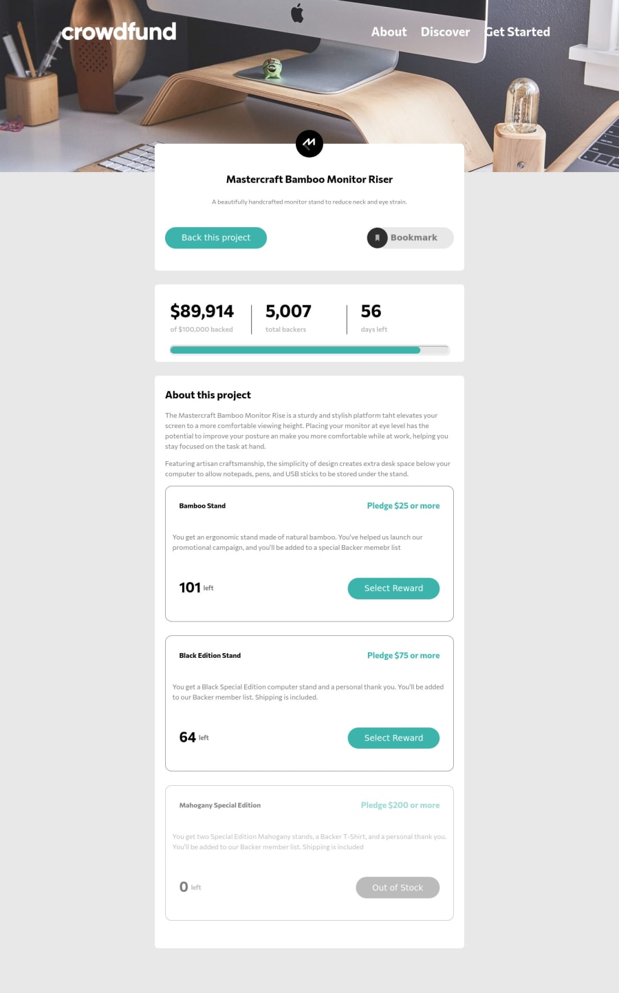
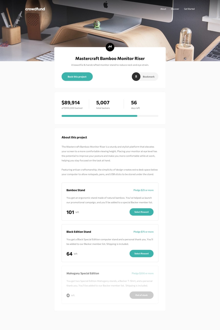
Hey, great work on this one the layout in desktop is good but the font-size for the navbar are lot bigger don't you think :>. The mobile view is good as well and it resizes good.
The modals works great, it functions well but one concern.
When I click the bookmark, it refreshes the site and I see that you declared it inside
atag. You can use the.preventDefault()method on thatatag in your javascript, so that it will not make the jump thing and reload. Also after I clicked it, I cannot "un" bookmarked it. You might want to check the javascript on that one.But still, you did good in here and if you need help, just drop your query okay^
1@valy-sPosted over 3 years agoHey @pikamart ,
Thank you for your feedback, I updated my solution taking in account your suggestions. You were right the font size was a little bit big, for some reason was smaller on my browser before deploying, but I think now looks good. It didn't passed my mind to handle the option to undo the bookmark button until you pointed out :D.
0@pikapikamartPosted over 3 years ago@valy-s Awesome, now any user can un-toggle those and it doesn't reset, really good job^^
0
Please log in to post a comment
Log in with GitHubJoin our Discord community
Join thousands of Frontend Mentor community members taking the challenges, sharing resources, helping each other, and chatting about all things front-end!
Join our Discord
