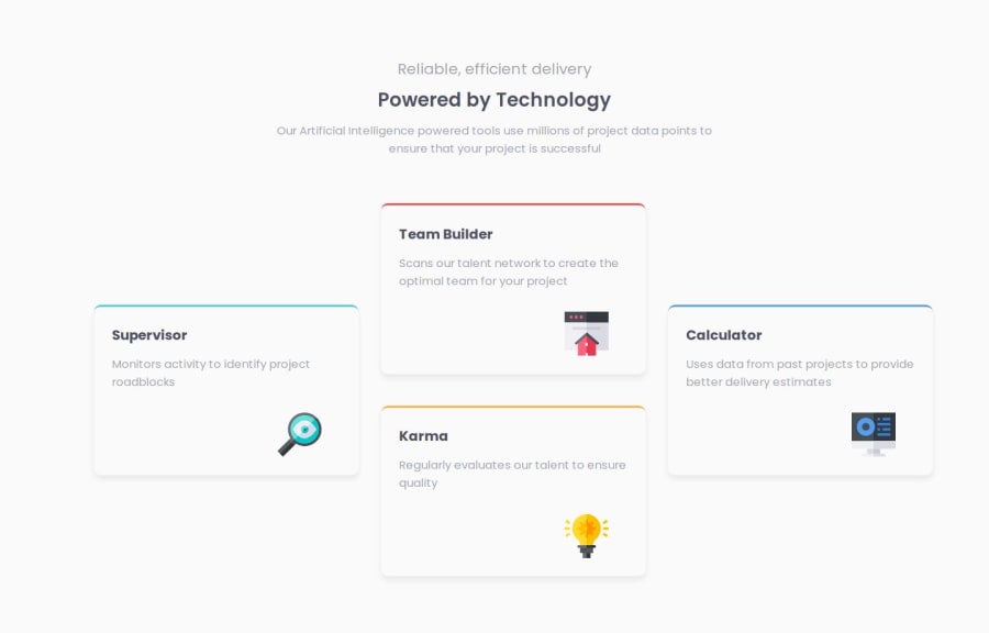
Design comparison
Solution retrospective
Attempting the second challenge of this section
What challenges did you encounter, and how did you overcome them?No notable challenge that i didn't figure out
What specific areas of your project would you like help with?Let's keep sharing ideas and constructive criticisms in the community
Community feedback
- P@kareemsakrPosted 4 months ago
Hi Ugo, great job on completing the challenge. I suggest you try to iterate over your solution until it has addressed the below point:
- Centering the heading section horizontally
- Make the background match the color provided in the syle-guide file
- You could just point to the images provided as below <img src="./images/icon-karma.svg" alt="Karma Icon">
no need to paste the svg code into your HTML
- use css variables for the colors/sizes (example below) :root { /* Primary Colors */ --red: hsl(0, 78%, 62%); --cyan: hsl(180, 62%, 55%); --orange: hsl(34, 97%, 64%); --blue: hsl(212, 86%, 64%);
/* Neutral Colors */ --very-dark-blue: hsl(234, 12%, 34%); --grayish-blue: hsl(229, 6%, 66%); --very-light-gray: hsl(0, 0%, 98%);
--xxs: 0.25rem; --xs: 0.5rem; --s: 0.75rem; --m: 1rem; --l: 1.25rem; --xl: 1.75rem; --xxl: 2.5rem; --xxxl: 3.5rem; }
Hope this helps, good luck
Marked as helpful0@Vanfrankie7Posted 4 months ago@kareemsakr Thank you for your insight, Kareem. For the centering of the Heading, i have added margin: 0 auto; to the heading container and pushed the changes to github. It is showing me that it is centered on my screen. I don't know why it is not centered on frontendmentor's page.
1@Vanfrankie7Posted 4 months ago@Vanfrankie7 Oh, i have solved it. After updating my code and pushing to my live server, i didn't "Generate New Screenshot" on Frontendmentor. i have now, and it looks just fine.
1
Please log in to post a comment
Log in with GitHubJoin our Discord community
Join thousands of Frontend Mentor community members taking the challenges, sharing resources, helping each other, and chatting about all things front-end!
Join our Discord
