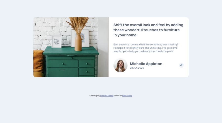
Design comparison
SolutionDesign
Solution retrospective
Feedback is ALWAYS welcomed!
Community feedback
- @ApplePieGiraffePosted almost 4 years ago
Hey, adluders! 👋
Nice effort on this challenge! 👏
A few things I'd like to suggest are,
- Adding
object-fit: coverto the image to ensure that is cropped and doesn't distort when the size of the card component changes. - Making sure the mobile social media popup doesn't appear in the desktop layout when the screen size changes from mobile to desktop (I think it would actually be better if you simply had a single social media popup and simply applied different styles to it on the desktop and mobile layouts).
- I think a little more padding around the profile information in the mobile layout of the card component would be a good idea. 🙂
Keep coding (and happy coding, too)! 😁
2@just-a-devguyPosted almost 4 years ago@ApplePieGiraffe Thank you for the detailed feedback. I honestly submitted this one without double checking the work. I shall make the time to fix those. They sound like easy fixes. I always appreciate the feedback on how to improve!
1 - Adding
Please log in to post a comment
Log in with GitHubJoin our Discord community
Join thousands of Frontend Mentor community members taking the challenges, sharing resources, helping each other, and chatting about all things front-end!
Join our Discord
