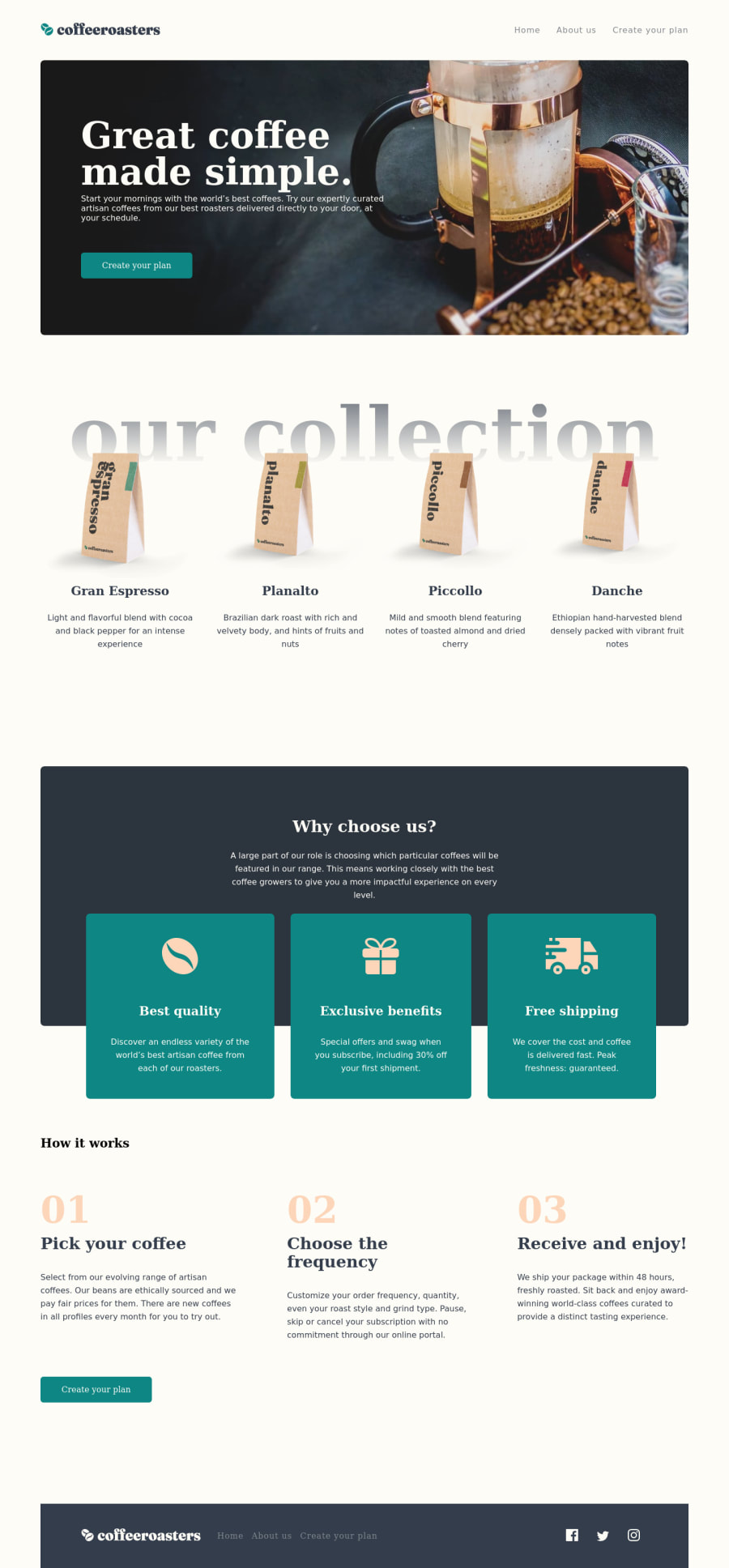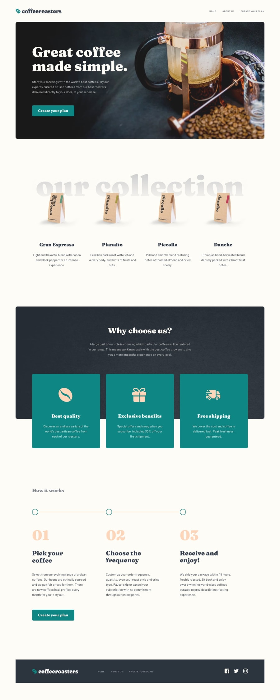
Design comparison
Solution retrospective
This one is 90% completed. It is one of those projects I bookmark to refactor later. But, if anyone reading this is interested in possibly figuring out where I left off and want to make pull requests to the repo, feel free to do so. While at it, please leave any and all feedback possible.
Community feedback
- @ApplePieGiraffePosted almost 4 years ago
Hi there, adluders! 👋
Nice work on yet another challenge! 🙌
I suggest,
- Adding the light-beige-ish background-color from the original design to the page.
- Increasing the font-size of the navigation links in the header of the page (they are quite small, at the moment).
- Changing the color of the navigation links in the footer of the page to a light color (not a dark color) upon hover so that they can easily be seen against the dark background of the footer.
- The buttons might be missing the font from the original design.
Hope those tips help. 🙂
Keep coding (and happy coding, too)! 😁
1@just-a-devguyPosted almost 4 years ago@ApplePieGiraffe thank you for this! I will make those updates today
1@just-a-devguyPosted almost 4 years ago@ApplePieGiraffe Hey, question for you. I'm looking into making those updates; however, I noticed that the button's fonts are what was listed from the design. Do you mind expanding a little on what you meant by updating the font? Everything else has been taken cared of :D
1@ApplePieGiraffePosted almost 4 years ago@adluders
Hey, adluders! Hm... that might have been an mistake on my part—I thought the font of the buttons looked different from that of the design preview after a quick glance and thought it might have been the font-family. 😅 They just look a little thinner, so it might be font-weight or maybe even just the way the same things look different on different browsers. No worries, then! 😀
Otherwise, I took a look at the rest of the changes and I think they look good! 👍
1@just-a-devguyPosted almost 4 years ago@ApplePieGiraffe LOL!! No biggie. I am beyond appreciative of you and your feedback. Please, please continue to drop them. It helps me a lot!
1
Please log in to post a comment
Log in with GitHubJoin our Discord community
Join thousands of Frontend Mentor community members taking the challenges, sharing resources, helping each other, and chatting about all things front-end!
Join our Discord
