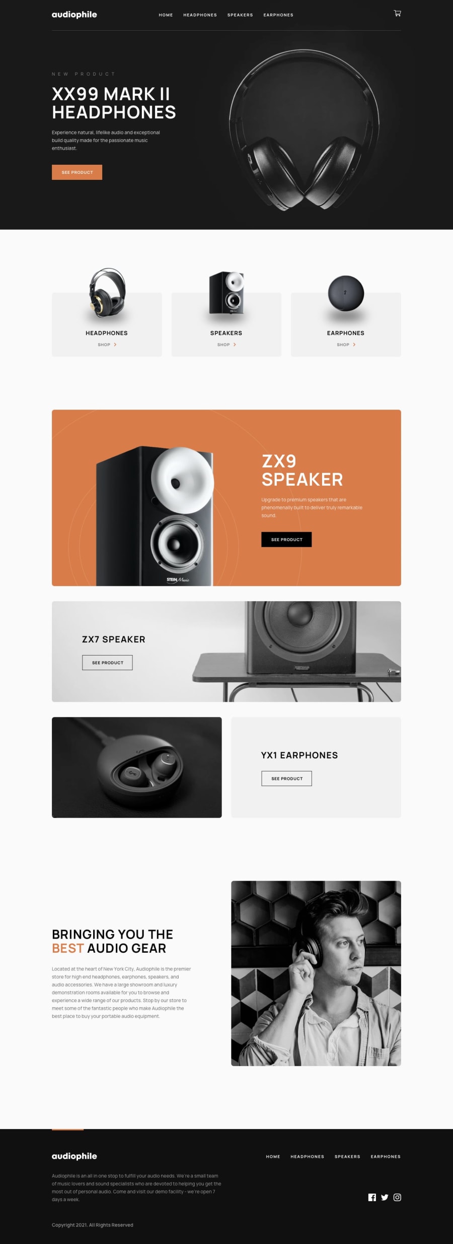
Built with gatsby, styled components and Sanity.io
Design comparison
Solution retrospective
Please feel free to interact and comment on where I falter. I tried to account for all edge cases but I don't know if I did. Please, anything that you see that seems out of place, do not hesitate to leave a comment.
Community feedback
- @anoshaahmedPosted almost 3 years ago
To get rid of the accessibility/HTML issues shown in your Report:
- have at least one
<h1>in your code <section>and<article>usually need a heading; so if you don't need a heading in it, use some other element such as<div>
Great job! :)
0@just-a-devguyPosted almost 3 years ago@anoshaahmed Thanks for the feedback! Only reason I did not have h1 in certain areas is because of consistency. I tried to keep all of my headings at a specific size and use them as appropriately as possible. In the future, I will try to toss a quick div in certain areas to avoid these. Once again, thank you for taking the time to review my project!
0 - have at least one
Please log in to post a comment
Log in with GitHubJoin our Discord community
Join thousands of Frontend Mentor community members taking the challenges, sharing resources, helping each other, and chatting about all things front-end!
Join our Discord
