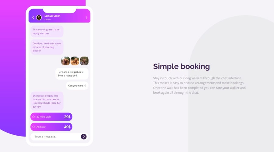
Built with flexbox mainly, suitable for all screens
Design comparison
Solution retrospective
If you have any recommendations, pls tell me❤❤🤞
Community feedback
- @petritnurediniPosted 10 months ago
Well done on completing the feature illustration challenge! 🎉 It's fantastic to see your skills in action, creating a responsive design purely with HTML and CSS. This project demonstrates a solid understanding of CSS styling and layout techniques. Here are some best practices and recommendations to further refine your work:
-
HTML Best Practices:
- Semantic HTML: Use more semantic elements where appropriate. Elements like
<nav>
,<section>
,<footer>
, and<article>
can provide better structure and readability to your code. - Image Alt Attributes: Good job including alt attributes for images. Ensure they are descriptive to improve accessibility.
- Code Structure: Your HTML is well-organized. Continue this practice to maintain readability as your projects grow in complexity.
- Semantic HTML: Use more semantic elements where appropriate. Elements like
-
CSS Best Practices:
- CSS Variables: You've made great use of CSS variables. This is excellent for maintaining consistency and ease of updates.
- Responsive Design: Ensure that your design is tested and adjusts smoothly across different screen sizes. Use media queries effectively to handle layout changes.
- Consistency in Styling: Keep a consistent styling approach, especially with units (px, em, rem), color formats (hex, rgba, hsl), and font sizes.
-
Accessibility and Performance:
- Keyboard Accessibility: Ensure that the UI components are navigable using the keyboard for accessibility.
- Loading Performance: Optimize images and assets to reduce load times, especially for mobile users.
-
Animation and Interactivity:
- Subtle Animations: Since you have a bonus challenge to animate the chat interface, consider using subtle animations like fade-ins or slide-ins to enhance the user experience without being too distracting.
- Interactive Elements: If there are any buttons or interactive elements, ensure they have appropriate hover and focus states.
-
General Suggestions:
- Cross-Browser Testing: Test your page across different browsers to ensure compatibility and a consistent user experience.
- Code Validation: Use tools like the W3C Validator to check your HTML and CSS for errors and standards compliance.
- Comments and Documentation: Use comments in your code to explain complex sections or styling choices. This will be helpful for others and for your future self.
Every project is a learning opportunity, and you're clearly on the right track. Keep challenging yourself and exploring new techniques. You're doing an amazing job! 💪
Marked as helpful1@RyanAbdaulPosted 10 months ago@petritnuredini
Dude I don't know what to say, I am over the moon for knowing all these things really. I do appreciate all what you wrote here, you can't imagine how much I am happy here, when I saw your message for the first time I was doing something but I read some of it, and literally I was excited to finish what I was doing to read it, you save a lot of time of mine, I'll make sure to save this comment and see it again very soon because I know myself I'll forget some of these things so I'll come back to it from time to time and apply what you've told me here.
I really thank you so much dude, peace be with you and have a great day ❤🔥
0 -
Please log in to post a comment
Log in with GitHubJoin our Discord community
Join thousands of Frontend Mentor community members taking the challenges, sharing resources, helping each other, and chatting about all things front-end!
Join our Discord