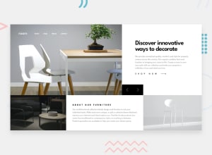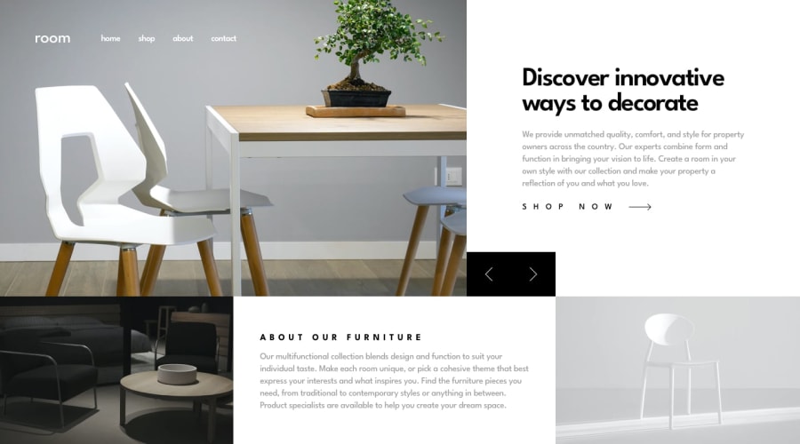
Design comparison
SolutionDesign
Solution retrospective
I am looking forward to seeing other solutions. I think the Design looks nice on paper, but there are some screens, where it doesn't look good, no matter what.
Community feedback
Please log in to post a comment
Log in with GitHubJoin our Discord community
Join thousands of Frontend Mentor community members taking the challenges, sharing resources, helping each other, and chatting about all things front-end!
Join our Discord
