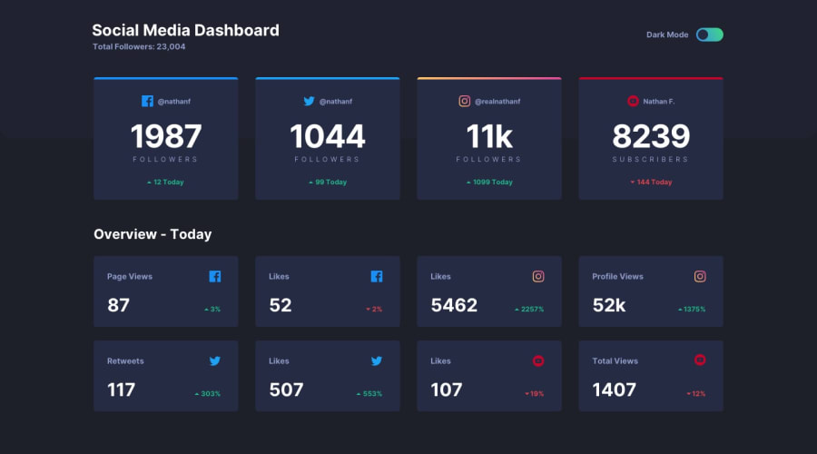
Design comparison
Community feedback
- @ramsaysewellPosted over 4 years ago
Hello,
I really like this solution that you have submitted, it looks well coded and definitely responsive.
A small tip for centering the slider icon used for your theme switcher, would be to, instead of using a fixed pixel value, use percentages instead. Here's the way I would use percentages:
top: 50%;
transform: translateY(-50%);
This will make sure that the icon is exactly in the middle of the slider bar and isn't able to go out of position.
Great job and keep up the great coding!
Ramsay
1 - @SdrummoloPosted over 4 years ago
Thanks a lot Ramsay, really appreciate the kind words. Also, i will definitely adopt your solution for the slider in future projects because it feels way less clumsy than mine
0
Please log in to post a comment
Log in with GitHubJoin our Discord community
Join thousands of Frontend Mentor community members taking the challenges, sharing resources, helping each other, and chatting about all things front-end!
Join our Discord
