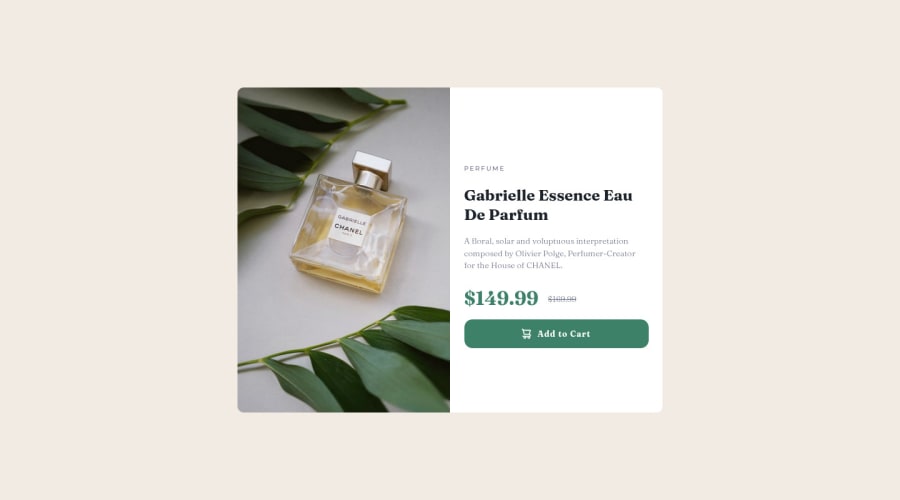
Design comparison
Solution retrospective
Feel free to leave any suggustions! I am also looking for an accountability partner to complete more of these projects message me if interested!
Community feedback
- @VCaramesPosted about 2 years ago
Hey there! 👋 Here are some suggestions to help improve your code:
- The Picture Element is being used incorrectly. It needs to have an image inside it to properly work.
Here is an example of how it works: EXAMPLE
Syntax:
  <picture>
    <source media="(min-width: )" srcset="">
    <img src="" alt="">
  </picture>
More Info:
https://www.w3schools.com/html/html_images_picture.asp
https://web.dev/learn/design/picture-element/
-
The Alt Tag Description for the image needs to be improved upon. You want to describe what the image is; they need to be readable. Assume you’re describing the image to someone.
-
The only heading in this challenge is the name of the perfume, “Gabrielle Essence Eau De Parfum” . The rest of the text should be wrapped in a Paragraph Element.
-
The old price 🏷 is not being announced properly to screen readers. You want to wrap it in a Del Element and include a sr-only text explaining that this is the old price.
-
Your button has the incorrect hover color applied. You want to look at the “style-guide” to see what the correct color is.
If you have any questions or need further clarification, let me know.
Happy Coding! 👻🎃
0
Please log in to post a comment
Log in with GitHubJoin our Discord community
Join thousands of Frontend Mentor community members taking the challenges, sharing resources, helping each other, and chatting about all things front-end!
Join our Discord
