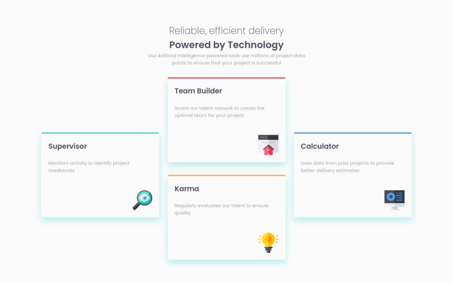
Design comparison
Solution retrospective
Please any feedback, especially on media queries and CSS Grid. Thanks!
Community feedback
- @pikapikamartPosted about 3 years ago
Hey, great work on this one. Desktop layout is fine just that the layout is bit wider and the box-shadow's color is not the same. The responsiveness could be better since right now at point 790px going down to mobile layout, the layout is being hidden thus creating a horizontal scrollbar. The mobile layout however looks great as well.
Some suggestions would be:
- The
bodydoes not need adisplay: gridsince the primary placement(grid) should be only used in the 4 card container. - The
h1should be using amax-widthwithremunit so that it will be consistent. Replace thewidthwith themax-width. ptag after theh1should be usingmax-widthas well instead ofwidthand userem.- Your usage of grid currently is not correct. Looking at the layout it place correct right, but
you usedtransform` to place it on the correct x-axis. Your grid should be using 3 column with 2 rows. Inspect the layout in html, hover on the container of the cards, you will see that its width is not correct with the cards, there are 2 columns but the cards are using 3 columns.
So the proper way is that like what I said, 3 column with 2 row. The left and right card, should only be using
translate-yto be adjusted on the correct position and the 2 middle card should not be using atransformsince it will be place correctly on thegtrandgtcand thegapwill make the spacing.- The 4 icons should be hidden so use
alt="'on it and extraaria-hidden="true"attribute. All decorative images should be hidden at all times.
Aside from those, great work again on this one.
Marked as helpful0 - The
Please log in to post a comment
Log in with GitHubJoin our Discord community
Join thousands of Frontend Mentor community members taking the challenges, sharing resources, helping each other, and chatting about all things front-end!
Join our Discord
