Submitted about 3 years ago
Built using React with Vite & Styled using TailwindCSS
@imadatyatalah
Design comparison
SolutionDesign
Solution retrospective
I would like to hear your feedback!
Community feedback
- @pikapikamartPosted about 3 years ago
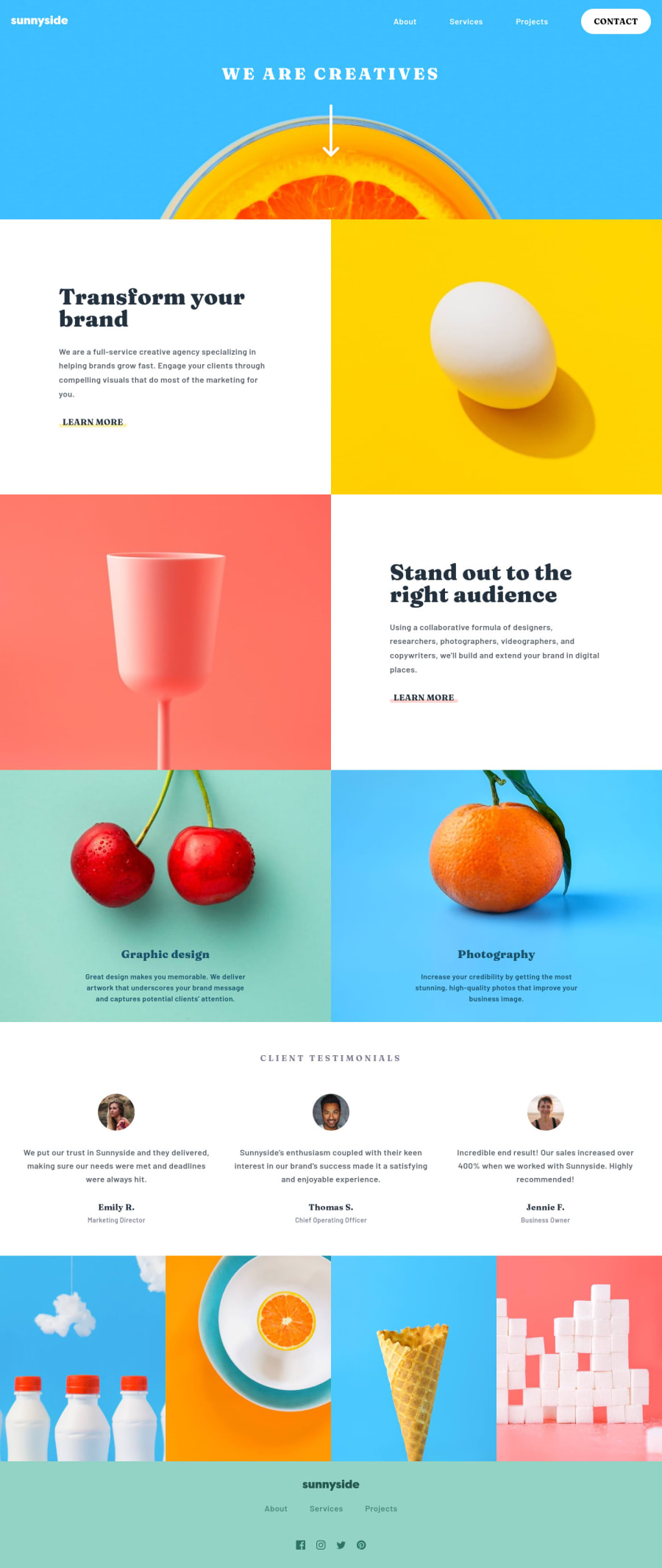
Hey, awesome work on this one. Desktop layout looks great, it is responsive and the mobile layout looks really good as well.
This is a good site tbh.
Some suggestions would be:
- Website-logo-link should have either
aria-label
attribute or a screen-reader only element inside it, describing where the link would take them, since you are usinghref="/"
the value could behomepage
. - Website-logo
svg
should be using a screen-reader onlytitle
element inside it, the text-content will be the name of the website,sunnyside
. - Arrow-icon
svg
should be hidden since it is just a decorative image so usearia-hidden="true"
attribute on it. - The person's position should be inside a
p
tag or wrap thesmall
withp
tag since it is a text-content. - The last 4 images at the very bottom could be hidden since it is only a decorative image and there are no text-content giving information about it so using
alt=""
witharia-hidden="true"
attribute on it would be really great.
FOOTER
- Same goes for the website-logo-link and website-logo, use the method I mentioned at the beginning.
- The 3 link after the logo could be inside a
nav
since it is still your website's navigational link. - Those social media icons could have used
ul
element since those are "list" of links. - Each
a
tag that wrap the social media icon should be using the same method as well with the website-logo. You do this method if there are no text-content inside the element where assistive tech could read to give meaning about what the element contains. - Each
svg
of the social media should be hidden since they are only decorative so usearia-hidden="true"
on it. - The
.attribution
would be great to be insidefooter
oraside
so that it is inside a landmark element as well.
MOBILE
- Hamburger toggle should also use the same method with using either
aria-label
attribute or screen-reader only element inside it, since thebutton
have no text-content inside. svg
inside thebutton
should be hidden as wellaria-hidden="true"
.- The
button
needs to have anaria-expanded="false"
as a default attribute, it will be set to "true" if the users toggles thebutton
and vice-versa. - The placement of the hamburger toggle and the dropdown is incorrect, you must always place first the toggle before the dropdown so that the focus of element , the dropdown is next to the button and not the other way around.
Again, this is really a great site and it feels great. Just those and still really great job on this one.
Marked as helpful2 - Website-logo-link should have either
Please log in to post a comment
Log in with GitHubJoin our Discord community
Join thousands of Frontend Mentor community members taking the challenges, sharing resources, helping each other, and chatting about all things front-end!
Join our Discord