Submitted about 3 years ago
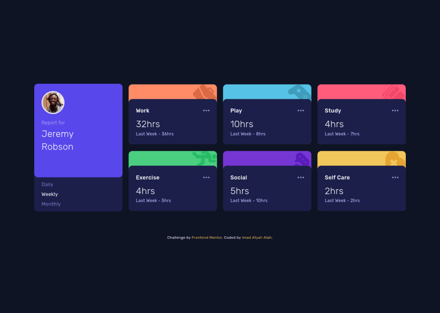
Built using React with Vite & Styled using TailwindCSS
@imadatyatalah
Design comparison
SolutionDesign
Solution retrospective
I would like to hear your feedback!
Community feedback
- @pikapikamartPosted about 3 years ago
Hey, awesome work on this one. Layout in desktop looks really good, it is responsive and the mobile state looks great as well.
Some suggestions would be:
- On the
daily weekly monthlysections, using onlyliis not really accessible. When creating an interactive component, use an interactive element. For those one, since you may have notice, those are selections which only one be chosen, hence you could have made use ofinput type="radio"inside thelielement. But to be honest, I wouldn't useulinstead I would usefieldsetalong withlegendto wrap those 3 selections. Each name would be thelabelfor theinput, thelegendwill describe what thoseinputdoes. This makes it more accessible for people. - For the 3 dots
svg, since those are only decoration, you should addaria-hidden="true"attribute on thesvg.
Aside from those, site looks really great.
Marked as helpful1 - On the
Please log in to post a comment
Log in with GitHubJoin our Discord community
Join thousands of Frontend Mentor community members taking the challenges, sharing resources, helping each other, and chatting about all things front-end!
Join our Discord
