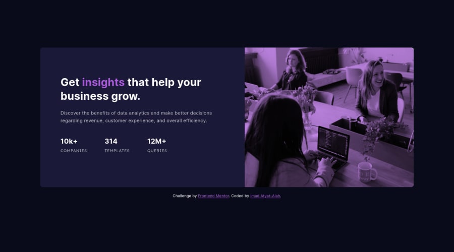
Submitted about 3 years ago
Built using React with Vite & Styled using CSS
@imadatyatalah
Design comparison
SolutionDesign
Solution retrospective
I would like to hear your feedback!
Community feedback
- @pikapikamartPosted about 3 years ago
Hey, awesome work on this one. Layout in desktop looks great, it is responsive and the mobile state looks really great as well.
Just some little suggestions on this :
- The image could use a more descriptive
altsincealt="people"does not really describe the image itself right since it is broad, make it more descriptive/meaningful. - Your
.stats-containercould have usedulsince those are "list" of information about the company website. - Also, inside in those list information, those text should not be using a heading tag because they don't really give content on what the section would contain right, so better using
ptag on them. - Lastly, it would be better if your
footeris outside themainso that it will be read as a primary landmark of your layout.
<main />
<footer />
Aside from those, really great work again on this one.
Marked as helpful2 - The image could use a more descriptive
Please log in to post a comment
Log in with GitHubJoin our Discord community
Join thousands of Frontend Mentor community members taking the challenges, sharing resources, helping each other, and chatting about all things front-end!
Join our Discord
