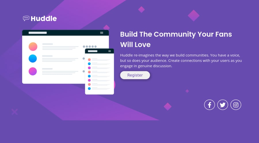
Design comparison
SolutionDesign
Solution retrospective
Hello fellow coders,
I am trying to make as many projects as I can to apply what I'm learning. On this particular project I wanted to try the grid layout to test my knowledge and as the previous projects were accomplished with flex-box. I had to admit, the SVG background did give me some agro. I was trying to make close to a perfect replica.
Please don't hesitate to message me if you have any advice if some of the code could be perfected. I'm trying my best and want to succeed in this career.
Thank you in advance for checking out my project!!! 😊🙂
Community feedback
Please log in to post a comment
Log in with GitHubJoin our Discord community
Join thousands of Frontend Mentor community members taking the challenges, sharing resources, helping each other, and chatting about all things front-end!
Join our Discord
