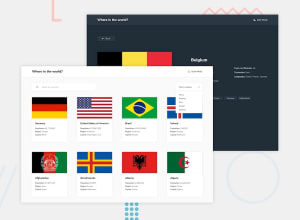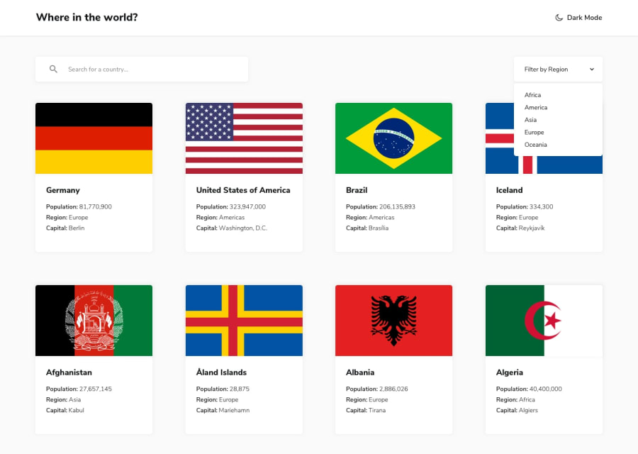
Design comparison
Solution retrospective
This was my first time using React or an API on my own for that matters, so please whatever feedback that can be provided would be extremely appreciated.
Community feedback
- @trun0Posted about 3 years ago
images are not visible
2@sadiejayPosted about 3 years ago@trun0 Noticed that too. I was wondering if aspect-ratio could create the consistency in flag images, but couldn't play around with it in dev tools as the images are broken.
0@trun0Posted about 3 years ago@sadiejay check whether the url you are accessing for country images is giving you the correct response or not.
0@just-a-devguyPosted almost 3 years ago@trun0 hey thanks for letting me know. I'll double check it
0 - @SahasSauravPosted over 4 years ago
try to have equal height for each flag card so you dont break the consistency of design and at desktop you have too much width for card
1@just-a-devguyPosted over 4 years ago@SahasSaurav I was able to fix one of the accessibility . As far as the images, I tried to do the equal height thing but the thing is some of the images are long regardless. Do you suggest I just give all images the length of whatever image is the longest and not worry about the excess white space for the smaller images? Also, as far as the other two accessibility issues, they're for an element that's not on the screen at all. Does that matter?
0 - @SahasSauravPosted over 4 years ago
try to use aria-label for inputs fields so the screen reader can uniquely identify them and this also reason for your accessibility issue
1
Please log in to post a comment
Log in with GitHubJoin our Discord community
Join thousands of Frontend Mentor community members taking the challenges, sharing resources, helping each other, and chatting about all things front-end!
Join our Discord
