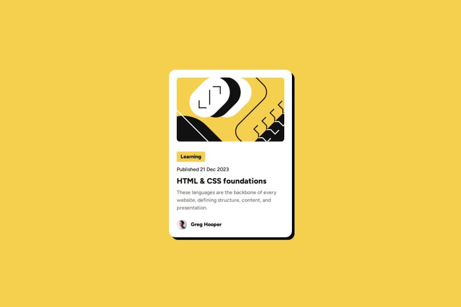
built the blog preview using flexbox


Design comparison

Solution retrospective
I am glad i was able to implement the hover effect and also implement the profile section using flexbox
What challenges did you encounter, and how did you overcome them?I found it very difficult to implement the profile section, but with the help of chat gpt i was able to complete it. right now, i need to learn flexbox properly
Community feedback
- @AdrianoEscarabotePosted 6 months ago
Hi Oluwasemilore Badejo, how’s everything? I think your project turned out great! However, I have some feedback that I think might be useful:
I noticed that in resolutions your component is growing a lot, to solve this we can do the following:
.container {
    position: absolute;
    top: 50%;
    left: 50%;
    transform: translate(-50%, -50%);
    max-width: 320px;
    border-radius: 20px;
    background-color: hsl(0, 0%, 100%);
    box-shadow: 8px 8px;
    border: 1px solid hsl(0, 0%, 7%);
}
Instead of using "width" to specify an absolute width, use "max-width" to specify a maximum instead. By doing this, the content will behave much more amiably in smaller resolutions, making it easier to make the project responsive.
The rest is amazing.
I hope this is helpful. 👍
0 - @EnodevsPosted 6 months ago
Great job @oluwasemilorebadejo, The colors complement each other very well, But I would advice to make it wider and less lofty so as to have more a more breathable space incase you want use it in a site of your own. Here are a few suggestions to make it better:
- You can add semantic elements to improve SEO
- Responsive Adjustments: You can add more breakpoints or modify existing styles to ensure everything looks good on various devices.
- Button for Actions: If you plan to add any interactions (like sharing or reading more), consider adding buttons with appropriate roles.
- Box Shadow: Adjust the shadow for the container on hover for a more pronounced effect. You might want to specify the color as well for consistency.
I hope these suggestions are useful and you will make good use of them in the future
0


Please log in to post a comment
Log in with GitHub
Join our Discord community
Join thousands of Frontend Mentor community members taking the challenges, sharing resources, helping each other, and chatting about all things front-end!
Join our Discord