Submitted almost 2 years ago
Built responsive page with tailwind, React, use context, redux
#react#redux#semantic-ui#tailwind-css#accessibility
@manishdevelops
Design comparison
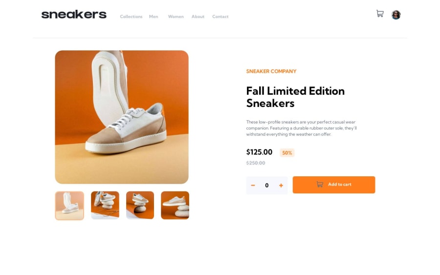
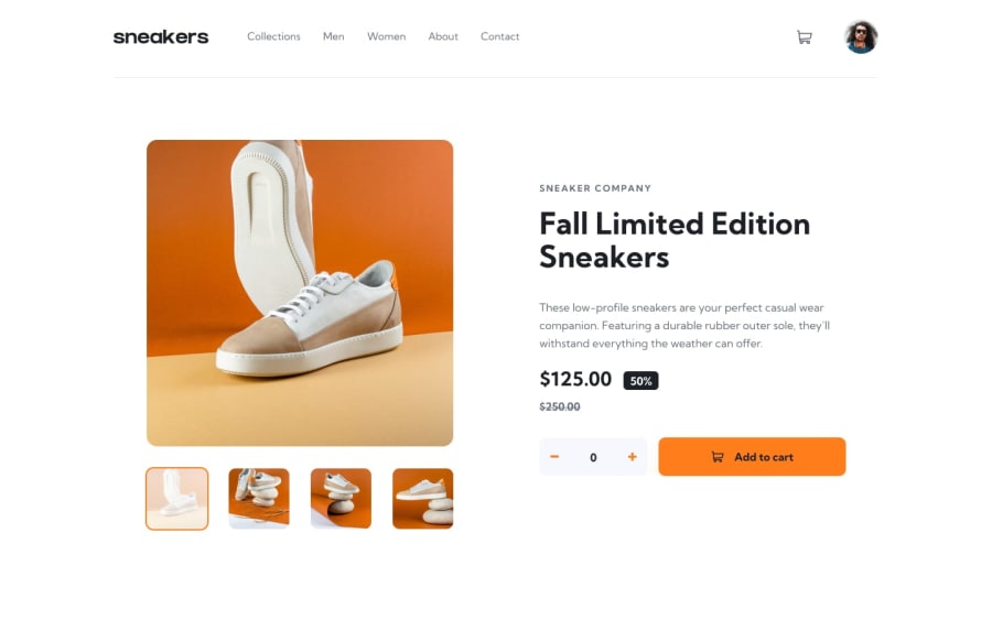
SolutionDesign
Solution retrospective
Any feedback is highly welcome👋
Community feedback
- @PaoloVilardiPosted almost 2 years ago
Hi @Manish-d-art, congrats for the great solution! Just a few things:
- the icon that indicates the item quantities on top of the cart (the orange one) is too big, I would add a fixed height (something like
height: 20px;will do the work) - the lightbox small images: you are changing the opacity while selected or on hover when you should apply a sort of white mask or filter on top. You can achieve it by using the pseudoelement
afterwith
position: absolute;
top: 0;
left: 0;
width: 100%;
height: 100%;
background-color: var(--white);
opacity: 0;
transition: all 0.2s ease-in-out;
and then when selected change opacity to the value you want (something like 0.7 would do the job).
- in the lightbox you should add the hover option for both the arrows for next and previous element and for the "x" close button
- Last thing I would change is that adding products already in the cart don't update the cart by adding the quantities but by replacing them. It needs just a little trick in the javascript: just check if the element is already in the cart, if this is true take the quantity stored in the item and update it, both in the logic and in the html for the icon on the cart and for the item inside the cart. Remember to update the total price too. Congrats again for your great solution!
Marked as helpful1@manishdevelopsPosted almost 2 years ago@PaoloVilardi Thank u, I will do the change..
1 - the icon that indicates the item quantities on top of the cart (the orange one) is too big, I would add a fixed height (something like
Please log in to post a comment
Log in with GitHubJoin our Discord community
Join thousands of Frontend Mentor community members taking the challenges, sharing resources, helping each other, and chatting about all things front-end!
Join our Discord
