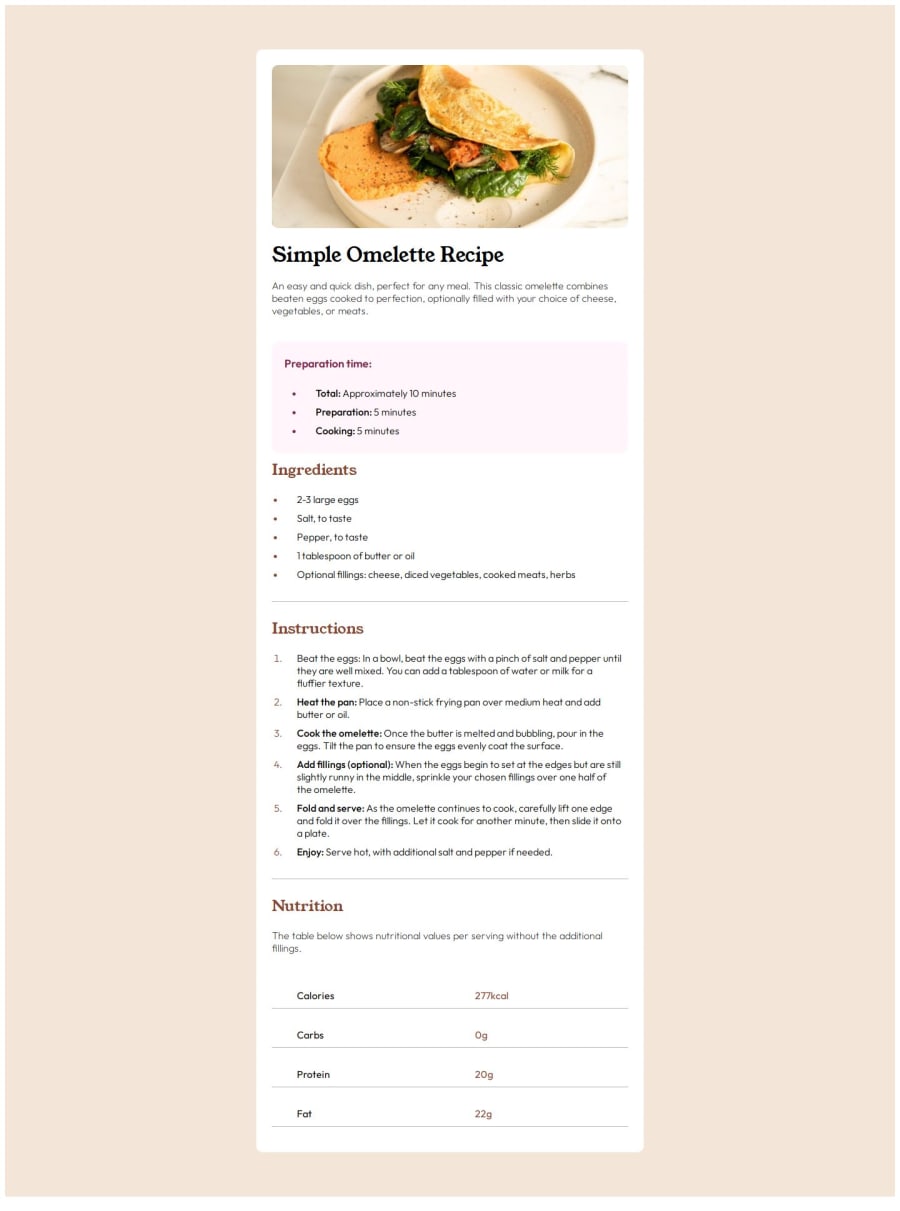
Design comparison
Solution retrospective
I think sticking to the program helps grow skill step by step
What challenges did you encounter, and how did you overcome them?- I used custom class for horizontal line instead on default element
- Used css properties li::marker and left padding on list element to define color for list bullet points and spacing
Community feedback
- @indigorosePosted 6 months ago
This is a nice solution and follows the design brief.
Whilst accessible, the solution does not match the mobile styles.
It is tricky as I struggled with the mobile styling, however using the
bodyelement selector in your css and changing thebackground-colorproperty will help to remove the white border in your solution and modify with@mediawhen required.The code is clear, efficient and reusable. I used the
li::markeras well to access thelicolour changes.As you keep trying other challenges, you will be able to return to this and refactor. Keep going and look forward to seeing your other solutions.
Marked as helpful0
Please log in to post a comment
Log in with GitHubJoin our Discord community
Join thousands of Frontend Mentor community members taking the challenges, sharing resources, helping each other, and chatting about all things front-end!
Join our Discord
