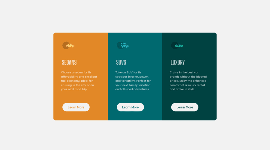
Design comparison
SolutionDesign
Solution retrospective
please have a look on my solution. This is the firs time I use CSS grid & flex.
Community feedback
- @RioCantrePosted almost 3 years ago
Hello there! Good job in completing this project. Looking at your solution I would suggest the following for you...
- It's best practice to specify the image size in the CSS style. Instead of inline style you could make another rule set with the following...
.logo img { width: auto; height: auto; }- As you code your project, it's better to organized the file. Create another file solely for CSS style. Add the link to the
headand eliminate thestyleproperty - Clean the whitespaces in your code
- Wrap the
containerwith specific tag likemainandattributionwithfootertag - Same goes with
buttoninstead of inline style you could emphasize the property in the CSS style from this...<button class="button" style="color:hsl(184, 100%, 22%) ;">Learn More</button>into
HTML: <button class="button btn-1">Learn More</button> CSS: .button.btn-1 { color: hsl(31, 77%, 52%); }- Add the hover state for each button as well...
.button.btn-1:hover {
  background: hsl(31, 77%, 52%);
  color: white;
  border: 2px solid white;
}
Hope this helps and Keep up the good work!
Marked as helpful1@FsaneaPosted almost 3 years agoGreat feedback thanks a lot @RioCantre , I'll make sure to follow these instructions in the next challenge.
1
Please log in to post a comment
Log in with GitHubJoin our Discord community
Join thousands of Frontend Mentor community members taking the challenges, sharing resources, helping each other, and chatting about all things front-end!
Join our Discord
