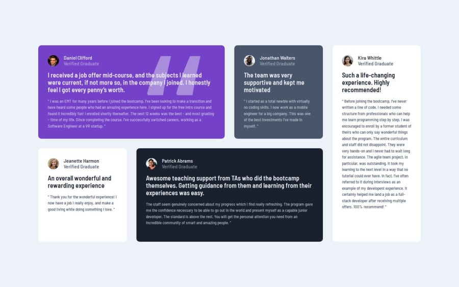
Built by grid for desktop, flex for phoneScreen, Interesting Animation
Design comparison
Solution retrospective
Hey Buds What's up 😆 I've finished this design finally, it was pretty easy, I've a question guys, when I open any international website, for example mozilla, and then teying to zoom in or making the screen smaller, I the responsive is brilliant 🔥
but of course I know that it's complicated and also who made it are pro programmers, but I wanted to do the same, look at the design again to understand what I'mma go to say right now.
have you? Great then, I was trying to make this cards, or testimonials coming bellow each other, i mean the more small the screen is, the more these cards or testimonials come bellow each other, but when I tried that it was so complicated really, and needs a lot of time, what I did instead so easy and clear you can check it out.
Ryan, why you're telling me that?? Okay, I'm telling you this because If you know how to do it, teach me because I really wanna do it, it's going to be so helpful, if you don't know yet but you know where can I learn this, tell me in the comments bellow, if you know a keyword for that, tell me in the comments bellow, okay? Deal, awesome😆🔥
That's it, I wish you're doing always brilliant and well, stay safe and peace be with you❤🤞
Community feedback
Please log in to post a comment
Log in with GitHubJoin our Discord community
Join thousands of Frontend Mentor community members taking the challenges, sharing resources, helping each other, and chatting about all things front-end!
Join our Discord
