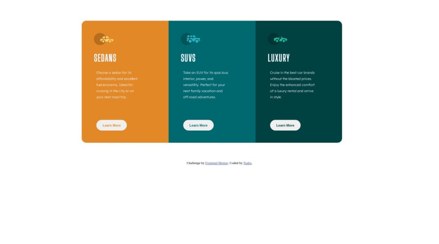
Design comparison
Community feedback
- @Islandstone89Posted 10 months ago
HTML:
-
Every webpage needs a
<main>that wraps all of the content, except for<header>andfooter>. This is vital for accessibility, as it helps screen readers identify the "main" section of a page. Change.rowinto a<main>. -
The icons are decorative, so the alt text should be empty:
alt="". -
Text should never be in divs alone.
.topicshould be a<h2>. You can wrap the<h2>in a<div>, though it is probably not needed here. -
Likewise,
style-tis a paragraph, so wrap it in a<p>. -
Don't use
<br>to force text onto a new line. The text should flow naturally, and all styling belongs in the CSS. -
The headings should be written with normal capitalization: "Sedans", "Suvs", and "Luxury". You then use
text-transform: uppercaseto change the capitalization in CSS. -
"Learn More" would navigate to another page, hence it is not a button but a link.
-
.attributionshould be a<footer>, and its text must be wrapped in a<p>.
CSS:
-
It's good practice to include a CSS Reset at the top.
-
font-sizemust never be in px. This is bad for accessibility, as it prevents the font size from scaling with the user's default setting in the browser. Use rem instead. -
line-heightmust also never be inpx. -
"Learn More" should have
border: none, notborder: 0px. Also, whenever you need to set a value to zero, write0, without including any units. -
Remove all
positioningproperties. -
Remove all widths and heights in
pxand%. You can set amax-widthin rem on the card container in case it gets too wide on larger screens. -
All styling should be done in the CSS, so move the styles for
.attributionfrom the HTML document to the stylesheet, and remove the ``
Marked as helpful1@Nadia-017Posted 10 months agoGreat feedback points , really appreciate for sharing these points @Islandstone89
1 -
Please log in to post a comment
Log in with GitHubJoin our Discord community
Join thousands of Frontend Mentor community members taking the challenges, sharing resources, helping each other, and chatting about all things front-end!
Join our Discord
