Not Found
Not Found
Not Found
Not Found
Not Found
Not Found
Not Found
Not Found
Not Found
Not Found
Not Found
Not Found
Not Found
Not Found
Not Found
Not Found
Not Found
Not Found
Not Found
Not Found

Submitted

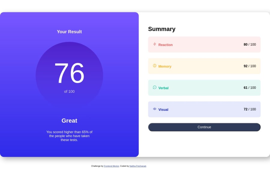
Building results summary component with HTML, CSS (flexbox)

@mewpotchanad

Desktop design screenshot for the Results summary component coding challenge

This is a solution for...

  • HTML
  • CSS
1newbie
View challenge

Design comparison


SolutionDesign

Community feedback

@Boyutife

Posted

Hi Nattha​ Potchanad​ 👋. Congratulations on successfully completing the challenge! 🎉

Great work on your markup so far! I have few suggestions that could further improve the structure and design of your webpage.

STYLE: 🎨🎨

You considering using relative units like em and rem rather than fixed units like px for your styling because of the following :

  • Accessibility: Using relative units can improve accessibility for users who may need to increase the font size or zoom in on a web page. With relative units, the font and layout will adjust accordingly, making it easier for users to read and interact with the content.

  • Responsive design: Relative units can also make your design more responsive, as they allow your layout to adapt to different screen sizes and device types. This can be especially important for mobile devices, where screen sizes can vary significantly.

  • Consistency: Relative units can help maintain consistency across your design, as they ensure that fonts and layout elements are sized in proportion to each other. This can make your design look more polished and professional.

  • Scalability: Finally, using relative units can make your code more scalable and easier to maintain, as changes to font or layout sizes can be made in one place and affect the entire design.

Also, instead of using a div tag to wrap your content, you might consider using a main tag, which is more semantically appropriate for indicating the primary content of your webpage.

In conclusion, to make your design more centralized and compact, you might consider setting a max-height and max-width property for your main container. This can help ensure that your content is displayed in a consistent and visually appealing manner, especially on smaller screens.

I hope these suggestions are helpful and will lead to an even better final product. Let me know if you have any further questions or need additional assistance!

HAPPY CODING

0

Please log in to post a comment

Log in with GitHub
Discord logo

Join our Discord community

Join thousands of Frontend Mentor community members taking the challenges, sharing resources, helping each other, and chatting about all things front-end!

Join our Discord