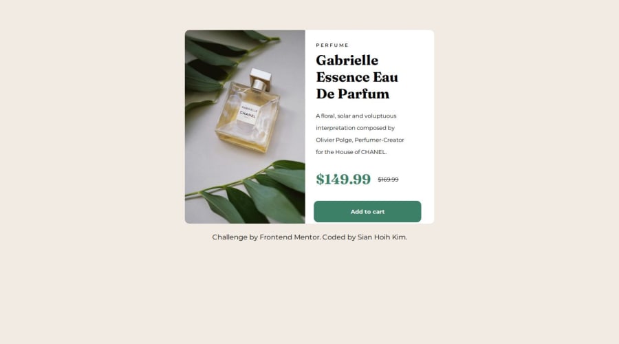
Design comparison
Solution retrospective
Firstly, I am proud that I finished the challenge in a day. It took me more than 4hrs to finished it. I am glad that I did not give up along the way : ) Next time, I would try to finish faster.
What challenges did you encounter, and how did you overcome them?Everything was okay until the background of the text were different from the box background. I couldn't find the reason and was stuck for more than an hour. I tried to search the solutions online but couldn't find anything. But luckily I just tried some methods here and there and it just work.(I still don't know why : )
What specific areas of your project would you like help with?My project turns out not that bad but the thing is I still don't know why when I put the text in the box(div) their background color are the same with the page background and not the same with box color. Somehow, with the help of the internet it works but I am still unsure why does it work? like what is the solution for that. Thank you.
Community feedback
Please log in to post a comment
Log in with GitHubJoin our Discord community
Join thousands of Frontend Mentor community members taking the challenges, sharing resources, helping each other, and chatting about all things front-end!
Join our Discord
