Submitted over 1 year agoA solution to the Recipe page challenge
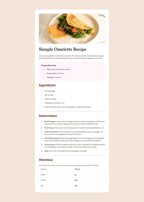
Building a desktop and mobile version of a recipe page
@emeraldknytt

Solution retrospective
What are you most proud of, and what would you do differently next time?
Like the last exercise before it, I am quite pleased with my design without using the Figma starter pack.
What challenges did you encounter, and how did you overcome them?There were a lot of challenges in this particular exercise.
- The image on the mobile view has a different style to the desktop view. I was able to solve it using another
divelement to style the class selector of the div. - Another problem is that I used used tables for the nutrition section but I could not style the bottom borders to form a single straight line.
I would appreciate it if someone could explain which is better for implementing the nutrition section: tables or grid property.
Thank you!
Code
Loading...
Please log in to post a comment
Log in with GitHubCommunity feedback
No feedback yet. Be the first to give feedback on emeraldknytt's solution.
Join our Discord community
Join thousands of Frontend Mentor community members taking the challenges, sharing resources, helping each other, and chatting about all things front-end!
Join our Discord