Building a Design in Stats Preview Card Component Main
Design comparison
Solution retrospective
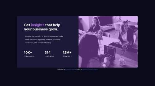
I finally done this challenge, I learn to have a thick skin to ask, glad there were constructive feedbacks given. I am proud of myself, although the result is not exactly the same as what expected.
I have difficulty in doing the card container, how to collapse the row into a column when in mobile size in other words to be responsive.
Also for the overlay. I think my way is not making the purple same as the sample.
Open for feedback. Thank you!!
Community feedback
- @grace-snowPosted over 2 years ago
First remove bootstrap. You don't need it you're not using it and it will introduce all sorts of problems. You need to know what everythimg is doing in your code
Next fix html
- Indent Code consistently so every closing and opening tag is inline and it becomes easier to read
- remove the h2s
- make the 3 stats into an unordered list with 3 items inside
- wrap either the number or word in a span or strong tag
For the layout start mobile first.
The card is a flex column, image then text all centred. Be methodical. Give the card a max width so it can never get too wide. Add padding and background colour to the half of the card that has text in it. Add margin top/bottom to elements within like the heading and paragraph. The stats list can be a flex column too, same principle.
enlarge the screen until there is room for the card halves to sit side by side. Add min width media query at that width. Change the flex directions to row and adjust text alignment as needed
For the image color all it needs is the purple background color on that half of the card and a mix blend mode
Good luck
Ps. This is why frontend mentor does not supply code to solutions, copying other people's code when different people might have different approaches and when the quality of work can vary so widely is not a good thing)
Marked as helpful3@kmeganizPosted over 2 years ago@grace-snow Thank you for your guidance. Because my company is using bootstrap and ask me to copy from bootstrap Lol
0@kmeganizPosted over 2 years ago@grace-snow Btw I am using vs code, the indent is good but I don't know when copy over to Github became all over the place. Anyway thank you ^.^
0@grace-snowPosted over 2 years ago@kmeganiz if you are going to use bootstrap then, you should barely be writing any css of your own. You need to read the bootstrap docs and follow their patterns and structure.
It will be very hard for you to learn css that way. You won't know css you'll just know bootstrap
Marked as helpful2@grace-snowPosted over 2 years ago@kmeganiz check your indentation settings in vs code. That usually happens when you've used a mixture of tabs and spaces. You can get it to auto format for you on save
Marked as helpful0 - @Martin-K-KamirPosted over 2 years ago
Like @grace-snow said. Doing bootstrap without not knowing css is very bad practice and won't get you far. In the end you still need to learn css. It's very bad pratice to learning any libaries before the actual language.
Also if you are struggling and copying code from other people. You will not learn anything. At start you should do some courses on udemy or atleast on youtube so you can start write your code by yourself. Which is best practice.
Marked as helpful1@kmeganizPosted over 2 years ago@Martin-K-Kamir Thank you for your suggestion, I have done the basic learning on Udemy and Codecademy and earn the certificate already. I have understand, but when it come to do it myself I am still blurred, I have hard time to make the item to be centralised or to be fluid etc. While my mentor not really teach me, I have to learn by myself, my mentor only tell me to google and copy code and try myself. I am so sorry for this.. huhu,,, wanna cry myself.. Maybe I am not suitable to be a developer, I am going to give up this role. Anyway thank you for the responds, really appreciated.
0@Martin-K-KamirPosted over 2 years ago@kmeganiz You should not give up. If especially you like frontend or coding/programing. Learning takes time. I started 4 years ago and finally 6 months back i get my first IT job as FE developer and still i feel like newbie. So if you like coding just keep learning. If you are struggling its part of the job. I see 10+ years developers struggle everyday. So if you are struggling now with this watch others solutions try to understand what they did. I know how it feels how it's hard on start coding on your own. What i would suggest you to if you want to solve this solution now look what others did and re-write their code (don't copy and paste).
Marked as helpful0@kmeganizPosted over 2 years ago@Martin-K-Kamir ok. I will remember your advice. to re-write and not copy paste ^-^
0 - @vanzasetiaPosted over 2 years ago
Greetings, Katherin! 👋
Congratulations on completing another Frontend Mentor challenge! 🎉 Nice work on this challenge! 🙌
I notice that you are importing jQuery. I would recommend removing it since you're not using it. 🙂
Grace and Martin have provided incredible feedback for you. Here is some feedback from me:
- Nice HTML markup! It's great that you fix the issues that have been highlighted! 👍
- For any decorative images, each
img
tag should have emptyalt=""
andaria-hidden="true"
attributes to make all web assistive technologies such as screen reader ignore those images. In this case, the header desktop image is decorative only. - I would recommend adding some
padding
on thebody
element to prevent the card from touching the edges of the browser. Currently, on mobile landscape view, the card is touching the top of the browser edge.
That's it! Keep it up! 👍
Marked as helpful0@kmeganizPosted over 2 years ago@vanzasetia Thank you for your valuable feedback. Nice to hear from you again ^-^
1@vanzasetiaPosted over 2 years ago@kmeganiz No problem! Glad to help! 😄
Marked as helpful0
Please log in to post a comment
Log in with GitHubJoin our Discord community
Join thousands of Frontend Mentor community members taking the challenges, sharing resources, helping each other, and chatting about all things front-end!
Join our Discord