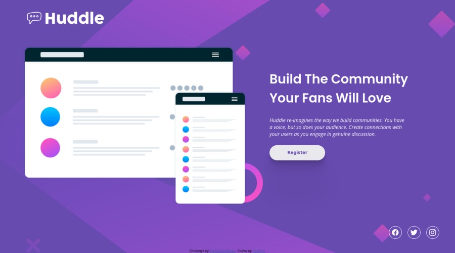


Design comparison
SolutionDesign

Solution retrospective
Any advices is welcome :)
Community feedback
- Account deleted
I see some minor mistakes when I compare the original design from your work.
- The brand's logo is too large in the desktop view and maybe add some more margin on top
- The text should'nt be italic.
- Button text should be lighter and should be increased a bit.
- The social icons' lose its padding in mobile view. I think it should be a fixed value.
- I think the original design is wrapped inside a container because the text and social icons are aligned.
Hope this helps
0
Please log in to post a comment
Log in with GitHub
Join our Discord community
Join thousands of Frontend Mentor community members taking the challenges, sharing resources, helping each other, and chatting about all things front-end!
Join our Discord