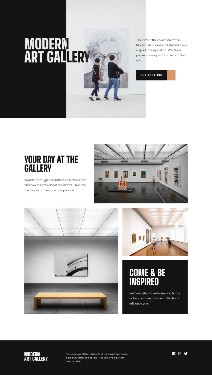
Build with modern CSS, Astro SSG and Mapbox custom designed map
Design comparison
Solution retrospective
Hi all,
this challenge was a fun one and i'm gonna try and explain my process.
I've used Astro on this project for building .html files. I know this is kinda overkill for this challenge but i'm lazy with syncing individual .html files especially repeating sections like footer etc...
Next i decided to create a custom map on Location page with Mapbox as i have some experience with it. It can be improved for sure but for this example i think it looks ok. I also added custom Pin from design and added Popup functionality as well.
For layout i've mostly used CSS grid with some Flexbox along the way where needed.
Images are marked with Picture element with multiple Source's for responsiveness. I've also added @2x versions where needed.
Lastly i've played with :hover state on buttons with @media(hover) to only target supported devices.
Let me know what you think!
Cheers, Miran
Community feedback
- @dwhensonPosted about 2 years ago
Hi Miran - another lovely and beautiful job here!!
Well done on using Astro, I'm keen to try and have a go at using it one day. I love the transitions you've added to the buttons, very nice!
I've very little I can add or suggest here. One thing is that when my mouse is over the map and I scroll the map zooms in and out, and I'd prefer to just scroll - this is especially the case on smaller screens where the map takes up more of the screen (but this is really a small issue).
On a much more general level, you might like to have a look at some of the approaches set out in every-layout.dev. Some of it is pretty advanced CSS layout stuff, but I don't think it will be too difficult for you! I love the approach to a more 'intrinsic design' approach, and it reduces a lot of the need for media queries.
Here's my solution of the same challenge that uses some of these approaches: https://www.frontendmentor.io/solutions/art-gallery-page-more-intrinsic-design-ESLbwbiu3t (my solution is no way as nice as yours, but I think I pretty much avoided break points completely in this challenge to create a more 'fluid' solution).
Obviously, this just depends on what kind of approach you'd like to use for CSS, but I've come to really like this way of doing things.
Keep up the lovely work! Very inspiring for me!
Cheers Dave
1@miranleginPosted about 2 years ago@dwhenson
Hi Dave, thanks for taking the time and checking my solution.
I agree that mouse wheel scrolling over the map can be annoying the say the least but i choose the lesser of two evils. I've disabled panning with finger/mouse because if that was allowed you wouldn't been able to scroll past header map in the Location page on mobile screen.
I've read through the "Rudiments" section on the every-layout page you mentioned on some other challenge and i really like "Units" and "Modular Scale" sections.
I've seen your take on this challenge and i saw that you had some issues with mix-blend-modes and text over dark background but could figure out how to fix it. I think the main issue was that text was not direct child of the background div or something like that.
I also noticed that you are using way more custom properties for spacing than i am and that is something i need to work on more.
Challenges on this platform are all following the same logic of spacing and aligning elements and someone clever enough would probably create macro layout system to handle any of these projects with a couple of smart predefined rules to apply everywhere.
Thanks again for your kind words and see you on another challenge!
Keep coding!
Cheers, Miran
1
Please log in to post a comment
Log in with GitHubJoin our Discord community
Join thousands of Frontend Mentor community members taking the challenges, sharing resources, helping each other, and chatting about all things front-end!
Join our Discord
