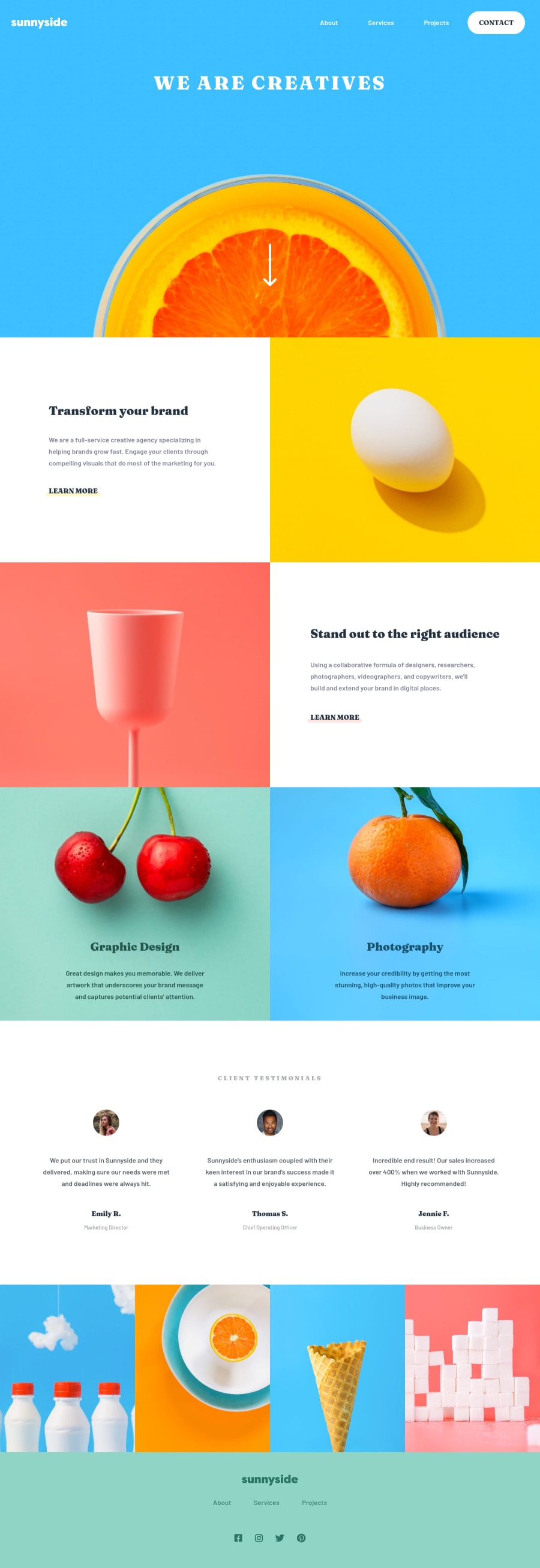
Build by SCSS, BEM, flex-box, grid-box, vanilla JavaScript and jQuery.
Design comparison
Solution retrospective
I've written all my processes in the README, you can find many details from there.
It may need to take some time to read, but I think it's worth it. (Because it really takes me so much time to writeπ)
If you think there is something that can be improved or any suggestions, please feel free to let me know.π
It's a long way to go on the front-end, but I will keep going, and I hope you like this work, thanks!π
Community feedback
- @mattstuddertPosted over 3 years ago
Now that's how to write a
README.md
file! π€© Haha. Amazing work on this project (and the README), Jim!You've done a great job, and your solution matches the design nicely. Here are some pointers that will hopefully help you:
- I'd recommend reading the accessibility report and try resolving those errors/warnings. Once you've updated your code, you can generate a new report using the button at the top of the report page.
- The "We are creatives" text should really be the
h1
on this page as it's the main heading. Also, you've uppercased the content in the HTML itself. Try to avoid doing that as some screen reader software will read this content letter-by-letter, which makes that content inaccessible to screen reader users. Instead, write it normally in your HTML and then usetext-transform: uppercase;
in your CSS to visually uppercase the text to match the design. This happens in a few other places in the HTML, so I'd recommend doing the same for the rest of the content. - It's great to see you using a
button
to trigger the mobile navigation. If you want to take it further and make it fully accessible, you can add attributes likearia-expanded
to help screen reader users. Here's a great article about building accessible mobile navigations to help get you started.
I hope those pointers help. Let me know if you have any questions!
Marked as helpful3@jubeattPosted over 3 years agoHi Matt,
First I want to say sorry for my late reply. (I was working on my challenge by the suggestions that you gave me yesterday.)
It's great to see your feedback, it means a lot to me, because I didn't expect I will get your feedback, so I'm really surprised by that.
And thanks for promoting my readme on slack and Twitter, If it can bring other people new ideas or inspiration, I think that's a very worthy thing to do.π
Thanks for everything you have done. I really appreciate that.π
Here is about your suggestion:
-
Fixed the accessibility report
I have updated my code and make all errors clear, Haha!π
-
Regarding the
<h1>
tagI was considering the
SEO
, for example, if I want to use google search for this site, I may use the keyword like "sunnyside"(like the company's name I guess?), It seems like that it has more representative about this website. Base on that so I didn't put<h1>
for the "We are creatives" because I regard it as a subtitle. (just from my perspectiveπ¦).But your suggestion also makes sense, so I've updated the code.
-
Regarding the capital letter issue
Honestly, I never know that would cause the problem for the screen reader software. now I get it. thank you for pointing that out.
-
Regarding the screen reader-friendly navigation
I've read the article that you pasted, It takes me some time to read (because I have to translate by myselfπ), but I think it's a great article. Just give me some times to get my head around this, when I get clear from it, I will update my code again.
BTW, I also want to translate it to a Chinese version on my blog to share to other people. hope it can help more people know about how to increase accessibility.
In the end, hope you don't mind my English may not very fluid, I only can use some simple word and sentence to write this.π¦
There's one last thing I gonna say: Frontend Mentor is really a wonderful place to learn how to develop.
I can see you really pay a lot of effort into it, and you really do a great job too, so hope you can keep it, and don't forget to stay awesome. Cheers!
1@mattstuddertPosted over 3 years ago@jubeatt, your English is good! π
- Great work on the accessibility errors! π
- Typically, you wouldn't put the logo/website name as the
h1
. This is because you back yourself into a bit of a corner because you're only supposed to have oneh1
on any page. Therefore, people using screen readers would only ever hear "Sunnyside" as the main heading, and you'd also lose out on a lot of SEO ranking potential. Theh1
should always be the main heading on the page that best describes and leads the following content. - π
- Yeah, there is quite a lot to that blog post! Take your time and keep practising to improve with each project. I'm sure the author would be happy for you to translate it. It might be worth trying to contact them first to see if they're happy for you to do it, but I can't see why they wouldn't be π
I'm delighted you're enjoying Frontend Mentor. We intend to stay around for a long time, so hopefully, everything keeps moving in the right direction! π€
Marked as helpful1@jubeattPosted over 3 years ago@mattstuddert
Hi Matt,
I've just updated the design and also write the record on the README
-
Thanks for the explanation. I've tried to use a screen reader by myself to listen to the content. and I think I get it, it makes more sense to put meaningful content for the
<h1>
, so it can bring more information for people. anyway, next time I'll pay more intensive on this part and do more practice. -
Yeah, it's a good suggestion, so I've asked the author and now I'm waiting for his reply, hopefully, everything will be fine!π
-
That's a great message for everyone!π
-
the one last question on my last update, I set the
role="navigation"
for the<nav>
, but the report says it is unnecessary for element<nav>
, and I also search something about this informations, what I get is some people say it actually would happen, but it just a warning and w3c didn't mean you can't use that, so I keep it.
0@mattstuddertPosted over 3 years ago@jubeatt yeah, the
role="navigation"
on anav
element is an odd one. It shouldn't be necessary, but I've read that there can be issues without it as well. It's fine to leave it in, as it's not going to cause any problems by having it on there πMarked as helpful0 - @anh-vumartellPosted over 3 years ago
Hello @julbeatt! Your solution looks awesome and thanks for a great README file. I've learned a lot from your reflection notes.
I'm a beginner in front-end development so I'm glad to learn from fellow front-end developers. I'd love to know which tool do you use to create the Structural drawing in your README file. Thanks and happy coding!
Marked as helpful0@jubeattPosted over 3 years ago@anh-vumartell
Hi Ngoc Anh,
I'm delighted the README is helping you learn something new.π
Indeed, it's nice to have many members who can teach each other while we learn these techniques.
There are a lot of things need to learn on the front-end, so I'm still working hard on it, hope we can get more improvement day by day and keep going!π
Regarding the structural drawing, actually, the pictures are all designed by photoshop, it's a great tool to use for me.
0 - @mbart13Posted about 3 years ago
hey, I saw your solution in Matt's newsletter
thought maybe you could be interested to know that aria-controls are not really recommended anymore https://heydonworks.com/article/aria-controls-is-poop/
0
Please log in to post a comment
Log in with GitHubJoin our Discord community
Join thousands of Frontend Mentor community members taking the challenges, sharing resources, helping each other, and chatting about all things front-end!
Join our Discord