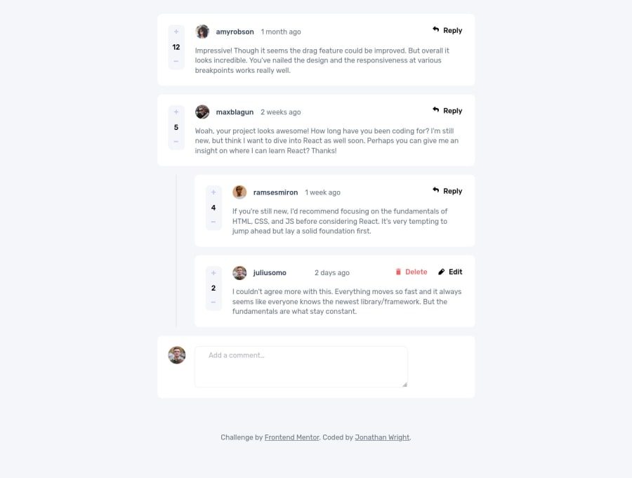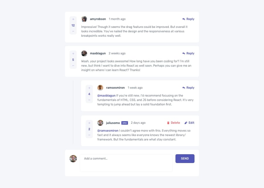
Bubbling, Modals and RegEx. Oh My!
Design comparison
Solution retrospective
I go into more detail with my challenges in my README file that you can find in my GitHub repo, but here are the highlights.
- The dialog element that I used for my Delete Modal was showing up on the page when it should have been hidden by default. This was due to an unexpected side effect of using Flexbox on the dialog element.
- I also had an issue with formatting the Dialog modal due to property inheritance. I had set margin and padding to zero for everything, which caused issues with the Dialog.
- It was easy enough to loop through the data and input top level comments on the page, but dealing with comment replies became more challenging. This is a challenge that Angular has always made easy for me, so it was fun to attack this without a framework.
- Another issue I've never dealt with because I've traditionally used frameworks: I couldn't get event listeners to work on elements that were being loaded to the page dynamically. I had to study up on event bubbling to find my solution.
- The last noteworthy issue I had was related to username callouts in the comments (e.g. @jonwright). I wanted to be able to change the formatting of these callouts, no matter where they were in the comment, but I didn't want to inadvertently change the format on email addresses. For this issue, I had to finally study up on regular expressions.
This project was much more challenging than I expected at first glance. I learned a ton, and I feel like my code improved a ton as I went.
Community feedback
- @JonathanmeijPosted almost 3 years ago
Great solution!
I found two thing that could be fixed. When you click on the arrow image, the reply editor is placed on top of the comment. And maybe you can try to make the reply editor disappear when you click it a second time, now it keeps adding new editors.
Rest of the site looks and works very good!
Marked as helpful1@Dr-Wrong-MoPosted almost 3 years ago@Jonathanmeij Thanks for the feedback.
I didn't even test clicking on the reply button multiple times. I paid attention to that when you click the edit button more than once, but neglected the reply button. Thanks!
As far as placing it at the top when you click the reply button, that was a design decision. I wanted the user to be able to see the comment they are replying to. If the reply array has 30 replies, and the reply field is at the bottom, the user can't refer back to the original text without scrolling up. The new reply will be sorted to the bottom when you refresh the page, though.
I appreciate you taking the time to check it out and comment. I'll have to suppress the reply button when the current user has an open reply field. I should also add a cancel button, even though that isn't in the design.
1
Please log in to post a comment
Log in with GitHubJoin our Discord community
Join thousands of Frontend Mentor community members taking the challenges, sharing resources, helping each other, and chatting about all things front-end!
Join our Discord
