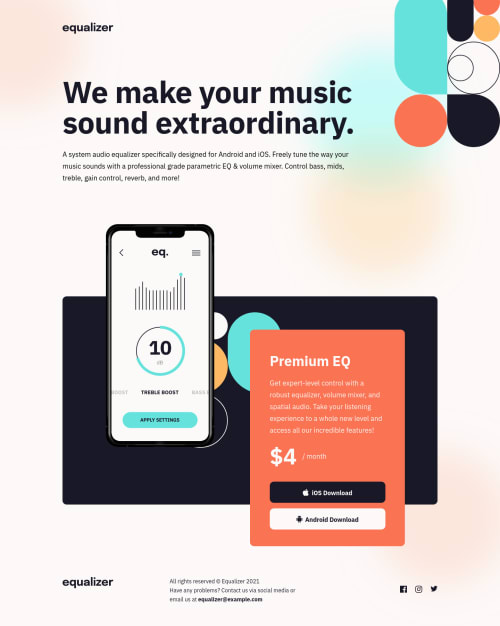
Bradley's Equalizer Landing Page built with Vue, Sass

Solution retrospective
This is my first project building from mobile first. In general, I tend to use 'rem' measures for sizing and sometimes spacing elements to keep layouts consistent. However, for typography, I used the exact px measures for font size, spacing, line height, etc. Is this a good approach? Any drawbacks?
I tried to scale the design for as many possible device layouts as I could, which meant adapting the design beyond mobile, table, desktop designs provided. I added responsiveness for narrow fold-able phones and hires desktops. Are there other devices that I should keep in mind when building?
I found layering the body elements very challenging since they were all askew from each other and had different layouts based on mobile vs not-mobile. It's odd that this project is labeled as beginner; or maybe, I still have a lot to learn about CSS!
Please log in to post a comment
Log in with GitHubCommunity feedback
No feedback yet. Be the first to give feedback on Bradley Smith's solution.
Join our Discord community
Join thousands of Frontend Mentor community members taking the challenges, sharing resources, helping each other, and chatting about all things front-end!
Join our Discord