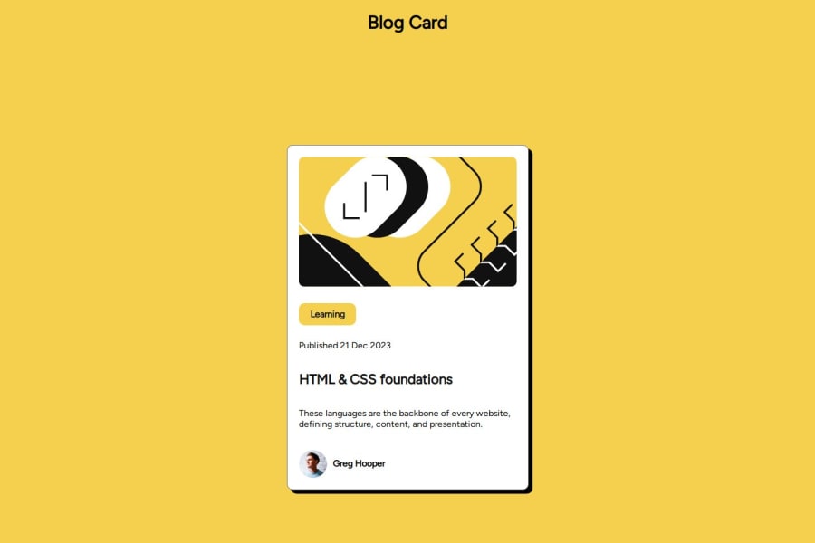
Design comparison
Community feedback
- @PTN6389Posted 5 months ago
I like how you organized your css, and used the variables for the color and radius. Also, I like how you used the min-content value for the max-width property on the 'Learning' button class.
There does seem to be a lot of spacing between the elements within the card. I used the display: flex, justify-content: center, and align-items: center on the body element instead of the card (.article) class, which helped with the spacing.
Marked as helpful0
Please log in to post a comment
Log in with GitHubJoin our Discord community
Join thousands of Frontend Mentor community members taking the challenges, sharing resources, helping each other, and chatting about all things front-end!
Join our Discord
