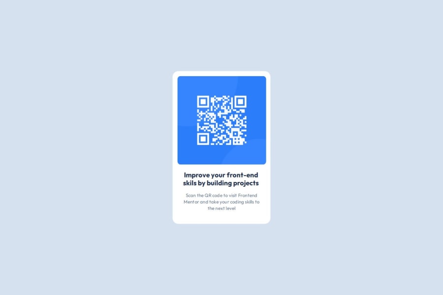
Design comparison
Solution retrospective
I am glad i was able to start the project and complete it.
What challenges did you encounter, and how did you overcome them?i encountered some challenges with wrapping the text like it looked like in the design
What specific areas of your project would you like help with?Gladly i was able to complete all so i am good
Community feedback
- @Grimm-NPosted 5 months ago
Hey, great work! 🌟 You're doing awesome, and I love seeing your progress. Just a couple of small tips:
-
Instead of pixels, try using relative units like em, rem, or percentages—they're more flexible and adapt better to different screen sizes. For example, rem scales beautifully with the user's default font size, keeping things consistent.
-
Since 320px screens are still a thing 📱, consider using 90vw or 90% for your cards on smaller screens. This way, they won’t stick to the edges of the window and will look more polished.
Keep it up! You're nailing this! 🚀
Marked as helpful1@quabenah-dtPosted 5 months ago@Grimm-N thanks for the feedback. Will make sure to do those changes
0@Grimm-NPosted 5 months ago@quabenah-dt Hey, you're very welcome! 😊 We're all here to help each other by reviewing and improving our code together—teamwork makes the dream work!
0 -
- P@cvalencia1991Posted 5 months ago
Hello good job of solving this challenges, this is my feedback to improve your project
- Please do not use pixel values
- Use figure tags and try to optimize the structure of the CSS
Marked as helpful0
Please log in to post a comment
Log in with GitHubJoin our Discord community
Join thousands of Frontend Mentor community members taking the challenges, sharing resources, helping each other, and chatting about all things front-end!
Join our Discord
