Submitted over 2 years ago
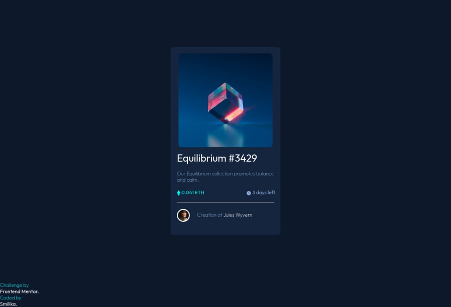
box flex and css icon positioning
@SangamSmilikaReddy
Design comparison
SolutionDesign
Community feedback
- @denieldenPosted over 2 years ago
Hi Sangam, good job! I took some time to look at your code and have some ideas for improving it:
- add
maintag and wrap the card for improve the Accessibility imgelement must have analtattribute, it's very important!- You can add the effect
:hovercreating adivthat appears on hover. I used tailwind but you can still see and understand which css properties you can use to do the same. Look here -> my solution - using
<hr>for the line is not the best way because this tag have a semantic meaning... in this case use div withborder-bottombecause this line is decorative - remove all
marginfromboxclass - try to use flexbox to the body for center the card. Read here -> best flex guide
- after, add
min-height: 100vhto body because Flexbox aligns child items to the size of the parent container alignattribute on thedivelement is obsolete
Overall you did well 😉
Hope this help and happy coding!
0 - add
Please log in to post a comment
Log in with GitHubJoin our Discord community
Join thousands of Frontend Mentor community members taking the challenges, sharing resources, helping each other, and chatting about all things front-end!
Join our Discord
