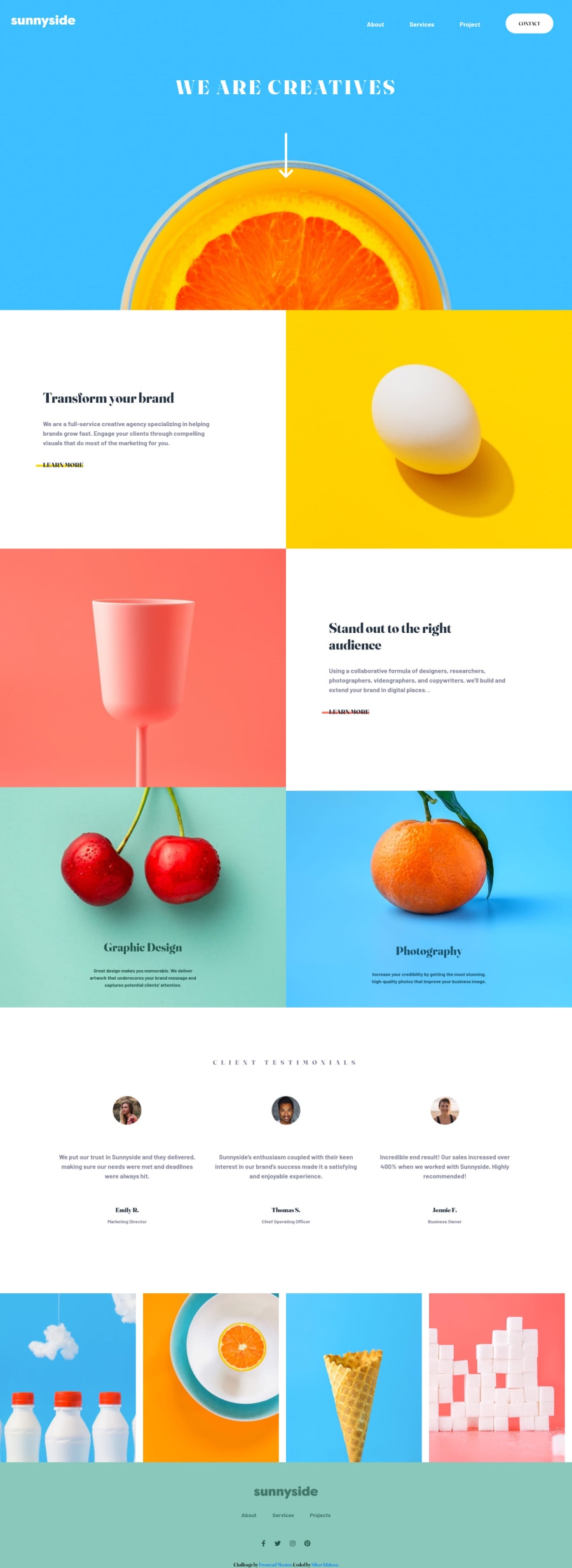
Design comparison
SolutionDesign
Solution retrospective
Hi, creating this project really helped my learning journey. I would love to know how I can improve. The mobile menu design was a bit difficult for me, I would need a resource or helpful insight on how I could achieve that.
Community feedback
- @PhoenixDev22Posted over 2 years ago
Hello
Congratulation on completing this challenge. Excellent work! I have few suggestions regarding your solution, if you don't mind:
HTML
- You can use the website's name as an alternate text. You can set alt=”Sunnyside”. If you are going to leave the logo not wrapped by
<a>
, it’s better to place it out the<nav>
as it does not navigate the user in anywhere(only an image).
- It’s not recommended to add event listener on non-interactive elements
toggle icon
. You can use a<button>
withtype=”button”
around the.home and .close
.
- Add and toggle an aria-expanded attribute to your toggle element letting the user know if the content the button controls is expanded or not. At first, it has the “false” as a value then you use JavaScript to change the value.
- You should use
aria-controls
attribute on the toggle element, it should reference theid
value of the<ul>
element.
- As it has no discernible name, put an aria-label on your trigger to describe its purpose. For example, you can have: aria-label='Mobile Navigation Trigger' or 'Open Menu.’
- look up a bit more about how and when to write alt text on images. Learn the differences with decorative/meaningless images vs important content. For decorative images, you set an empty
alt
to it with anaria-hidden=”true”
to remove that element from the accessibility tree. This can improve the experience for assistive technology users by hiding purely decorative images.
- Use the
<nav >
landmark to wrap the footer navigation witharia-label=”secondary “
oraria-label=”footer”
. A brief description of the purpose of the navigation, omitting the term "navigation", as the screen reader will read both the role and the contents of the label. Thenav
element in the header could use anaria-label="primary"
oraria-label=”main”
attribute on it. The reason for this is that, You should add thearia-label
for a nav element if you are using the nav more than once on the pag.You can read more in MDN
- To make an accessible logo (important content), the SVG does not contain any visible text that describes the graphic, we need to add the alternative text (invisible) by:
<title>
A short title of the SVG</title>
.- Add the appropriate ID’s to the
<title>
. - It must be the first child of it’s parent element.
On the
<svg>
tag, addaria-labelledby="uniqueTitleID”.
- The links wrapping the social icons must have
aria-label
or sr-only text indicate where the link will take the user. Then addaria-hidden=”true”
to the iconss that make them be ignored by screen readers to avoid redundancy and repetition.
Overall, great job on this one. Hopefully this feedback helps.
Marked as helpful0@SilverBeingPosted over 2 years ago@PhoenixDev22 Thank you for your feedback. I have a lot of work to do in regards to web accessibility.
1@PhoenixDev22Posted over 2 years ago@SilverBeing Happy coding !
Marked as helpful0 - You can use the website's name as an alternate text. You can set alt=”Sunnyside”. If you are going to leave the logo not wrapped by
Please log in to post a comment
Log in with GitHubJoin our Discord community
Join thousands of Frontend Mentor community members taking the challenges, sharing resources, helping each other, and chatting about all things front-end!
Join our Discord