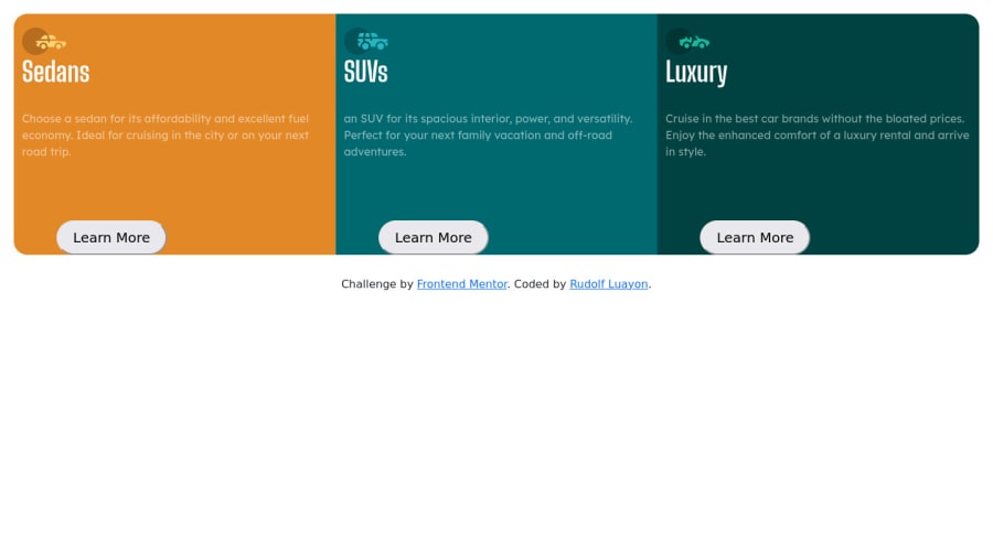
Design comparison
SolutionDesign
Solution retrospective
A very nice challenge for a beginner like me.
One of the challenges that I encounter when making is the responsiveness of the column.
Feel free to comment down below if you have any suggestions
Thank you!
Community feedback
- @vanzasetiaPosted over 2 years ago
Hello there, Rudolf! 👋
First, you need to fix the HTML.
- Remove all the
br
elements. Usemargin
orpadding
to create a space between each element. It's best to not usebr
elements for presentational purposes. Read what MDN documentation says about it. - Fix the indentation. Each child element should have indented to make it easier to distinguish which element is a child element and a parent element. I recommend two spaces for the indentation.
- Use
h2
instead ofh1
. Each page should only have oneh1
. However, other heading tags can be used multiple times. - Add
aria-hidden="true"
to thesvg
element or useimg
element with emptyalt=""
to make sure that they don't get pronounced by screen readers since those icons are decorative images. - Attribution should live outside the
main
element and should be wrapped byfooter
landmark. - I think those buttons should be link elements. As a user, I would expect after I click one of those buttons, I would get navigated to another page. So, what do you think is going to happen after the user clicks button?
Once you fixed the HTML, try to follow this guide to fix the responsiveness of the site.
- First, I would not recommend using CSS framework to do this challenge. In my opinion, not only it's too overkill to use a CSS framework but also newbie challenges (at least for me) are challenges to sharpen your CSS skill. Unless you have got a reason for doing this, I recommend doing this challenge with pure CSS.
- After you decide that, now some tips to to make the card responsive.
- The cards don't need any
height
. Let the content inside it dictate the height of each card. - The container (element that wraps all the cards) only needs a
max-width
to control how to big the cards are allowed to grow. - If you find yourself repeating the same styling for each card, I recommend creating a
card
styling and then addingcard
class name to each card. This way, you don't have to keep changing three cards styling.
- The cards don't need any
That's it! Hope this helps.
2@dumpdope1Posted over 2 years ago@vanzasetia Thaaaànk you so much for this feedback appreciate it.
0 - Remove all the
Please log in to post a comment
Log in with GitHubJoin our Discord community
Join thousands of Frontend Mentor community members taking the challenges, sharing resources, helping each other, and chatting about all things front-end!
Join our Discord