Submitted almost 3 years ago
Bootstrap, css, html, javascript, fontawesome, jira, github
@pittyh6
Design comparison
SolutionDesign
Solution retrospective
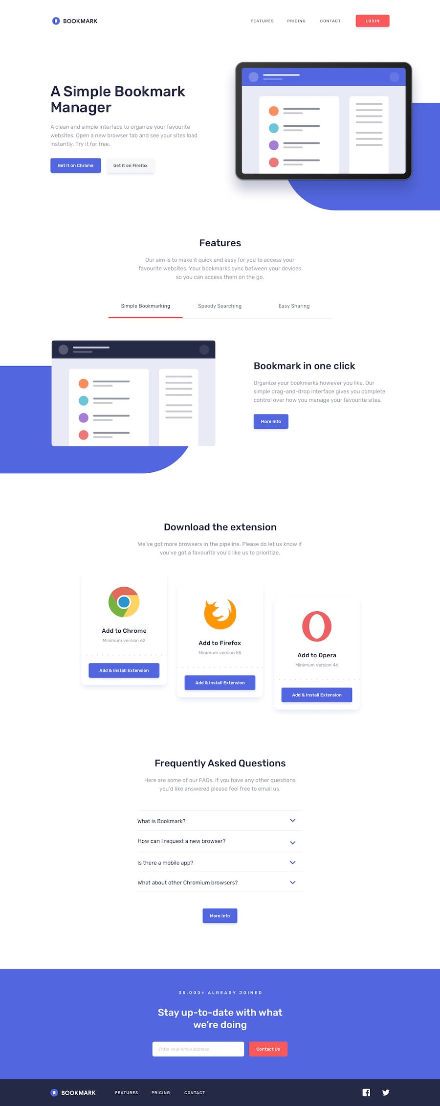
Hi there. Could you give me your opinion about my code? What I can do to get better? How can I organize my code? Everything that can help me to be a better developer. Thank you..
Community feedback
- @al3xbackPosted almost 3 years ago
Hi Priscila,
My feedback is:
- try to add space between
section.
.small-content { ... padding: 60px 0; }- for the shape bg, would be better if we set it behind the content by adding negative z-index.
.shape-fe {
   ...
   z-index: -1;
}
0 - try to add space between
Please log in to post a comment
Log in with GitHubJoin our Discord community
Join thousands of Frontend Mentor community members taking the challenges, sharing resources, helping each other, and chatting about all things front-end!
Join our Discord
