Not Found
Not Found
Not Found
Not Found
Not Found
Not Found
Not Found
Not Found
Not Found
Not Found
Not Found
Not Found
Not Found
Not Found
Not Found
Not Found
Not Found
Not Found
Not Found
Not Found

Submitted

Bootstrap 4.5

@ShrutiShinde418

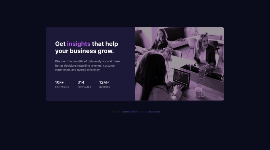
Desktop design screenshot for the Stats preview card component coding challenge

This is a solution for...

  • HTML
  • CSS
1newbie
View challenge

Design comparison


SolutionDesign

Solution retrospective


How to change the color of the image to the color given in the output? Any other feedback given would be great.

Community feedback

@pikapikamart

Posted

Hey, great work on this one. Layout in desktop is good, the mobile is good as well. However, your breakpoint for mobile layout is too early. Adjust those because your desktop layout could be shown more before going into mobile layout.

darryn already said a great feedback, i'm just going to add few as well:

  • Instead of using margin to center the content on your .card selector, you might want to use:
main {
  align-items: center;
  display: flex;
  justify-content: center;
  min-height: 100vh;
  padding: add some to the top and bottom
}

Because as you may see, if you inspect your layout in dev tools, hover on the body or main, it doesn't really capture the whole layout, because margin doesn't accumulate to an element's dimension, unlike padding. The above stylings also will always make sure that the content is centered properly.

  • The h3 tag could be an h1 element on this. For every webpage, there should at least be 1 h1. Also, avoid skipping a heading tag level. If you used h3, make sure that there is a h1 and there are/is h2. Do not skip a level.
  • Those 3 website information could use a ul element, since those are list of data about the company right. If there are elements on your layout, that seems a list, ul element is the right pick.
  • The alt value of the img should have a more descriptive value. Also, avoid adding words that relates to "graphic" like "icon, logo, image, picture" do not add them as a value in the alt attribute. Assistive tech will handle those for you.
  • Lastly, changing the breakpoint will be really awesome.

Still, you did a good job in here.

Marked as helpful

2
darryncodes 6,430

@darryncodes

Posted

Hi Shruti,

  • it might be worth trying a solid linear-gradient with a background image: background-image: linear-gradient(hsl(277, 64%, 61%), hsl(277, 64%, 61%) ), url(../your/image-filepath);
  • also explore background-blend-mode

All the best!!

Marked as helpful

1

Please log in to post a comment

Log in with GitHub
Discord logo

Join our Discord community

Join thousands of Frontend Mentor community members taking the challenges, sharing resources, helping each other, and chatting about all things front-end!

Join our Discord