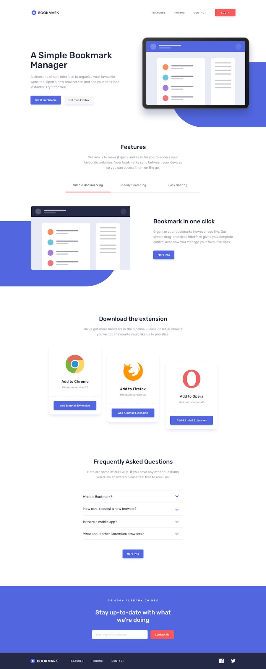
Bookmarks landing page with Nuxt.js & Vuelidate
Design comparison
Solution retrospective
I am continuing to use these projects to get more reps in with NuxtJS. We are using this framework at work, and it is helpful to work through these projects to get more experience with Nuxt.
Those big purple blobs behind the hero and featured section images were an interesting challenge. I tried several approaches using ::before and ::after pseudo attribute selectors, but decided to use an empty div using aria-hidden="true".
This ended up being a much larger project than I originally anticipated, but it introduced me to some new ideas, so it was definitely worth it. One thing I learned is the Vue.js <component is="h2">/<component is="h3">. The thing I like about this is that it allows me to create a reusable component while ensuring proper semantics within the document flow. No more worrying about using an h2 element inside a component that should really contain an h3.
The more of these I do, the more I find opportunities to improve my component development. I assert that these submissions are not perfect, but give me an opportunity to reflect on my progress as I continue to learn.
Community feedback
- @mattstuddertPosted almost 5 years ago
Really nice work again Joshua! Your projects are making want to work with Vue again 😍 I used it a few years ago, but have been almost exclusively React since. It's great to see that these projects are helping you find out new techniques and approaches to use.
1@somecallmejoshPosted almost 5 years ago@mattstuddert Thanks, Matt. Maybe, and that's a big maybe, I'll attempt these in React some day. For now, I'm happy to keep exploring the Vue world. :-)
1
Please log in to post a comment
Log in with GitHubJoin our Discord community
Join thousands of Frontend Mentor community members taking the challenges, sharing resources, helping each other, and chatting about all things front-end!
Join our Discord
