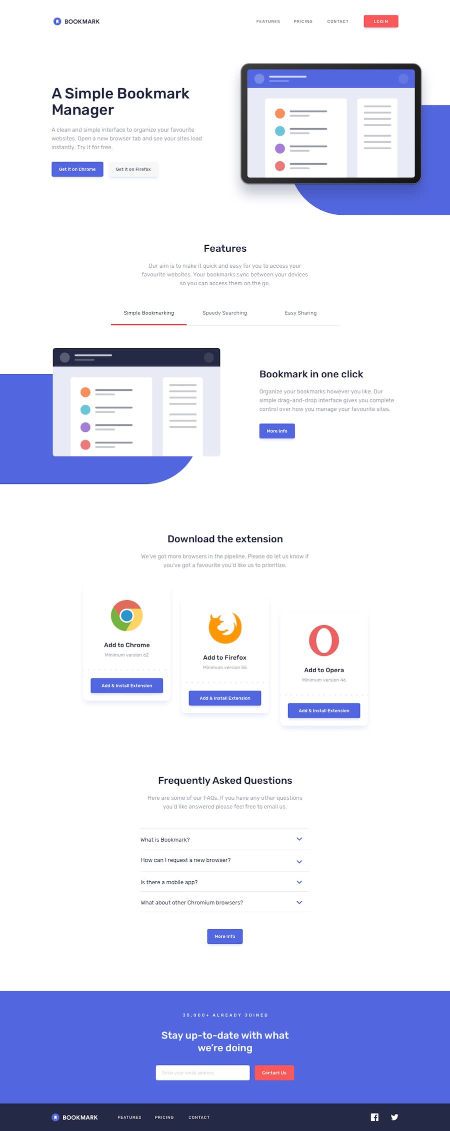
Design comparison
SolutionDesign
Solution retrospective
How do you find my work? Appreciate your feedback, thanks in advance.
Community feedback
- @ApplePieGiraffePosted almost 4 years ago
Hey, Nihat4ik! 👋
Nice work on this challenge! Your solution looks good and is responsive! 👏
I suggest,
- Allowing the accordion tabs to be opened by clicking on the entire tab (not just the arrow icons) to make them easier to open.
- Getting rid of the sharp corners around the hero tablet illustration.
- Making sure there is no "jump" in the position of the content below the feature tabs due to the border of the active being removed and replaced.
Keep coding (and happy coding, too)! 😁
1
Please log in to post a comment
Log in with GitHubJoin our Discord community
Join thousands of Frontend Mentor community members taking the challenges, sharing resources, helping each other, and chatting about all things front-end!
Join our Discord
