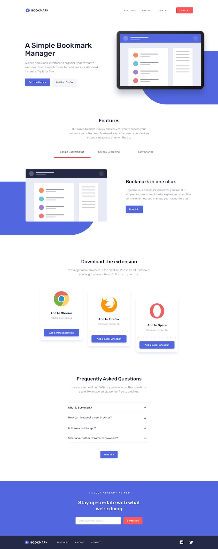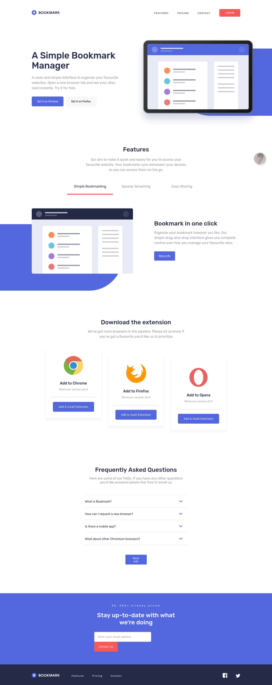
Design comparison
Solution retrospective
Hello, fellow devs 👋 this one took me a while, it really was challenging. Had a lot of fun completing this project, and learned many new things along the way. Thanks to @applepiegiraffe, his code helped me out with some of the problems and I did add an extra feature that I got from @applepiegiraffe 's solution 💖💖. Loved this challenge hopefully we will get to see more of these amazing challenges. Any feedback will be highly appreciated, Thank you 😀😀 Have a great day 👋👋 keep on coding 😎
Community feedback
- @ApplePieGiraffePosted over 3 years ago
Hello there, Mansoor Roeen! 👋
Amazing work on this challenge! 🙌 I'm glad to hear my solution inspired and helped you a little and the little attribution bubble you added made my day! 😂 The rest of your solution looks great and responds nicely (the smooth transitions on things are cool, too)! 👍
I suggest,
- Making sure that the image for the tabs section changes when it is out of sight (not when it comes back into view) to make the animation as smooth as possible.
- Labeling the input element in some way to identify it and improve the accessibility of your solution and clear up an error on your solution report.
- Adding a
<title>
tag to the inline SVGs to identify them, too, and clear up the rest of your solution report.
Hope those tips help. 😀
Keep coding (and happy coding, too)! 😁
1@mansoor-roeen-glitchPosted over 3 years ago@ApplePieGiraffe Thank you for your helpful suggestions, really appreciate it. keep coding 😁
1
Please log in to post a comment
Log in with GitHubJoin our Discord community
Join thousands of Frontend Mentor community members taking the challenges, sharing resources, helping each other, and chatting about all things front-end!
Join our Discord