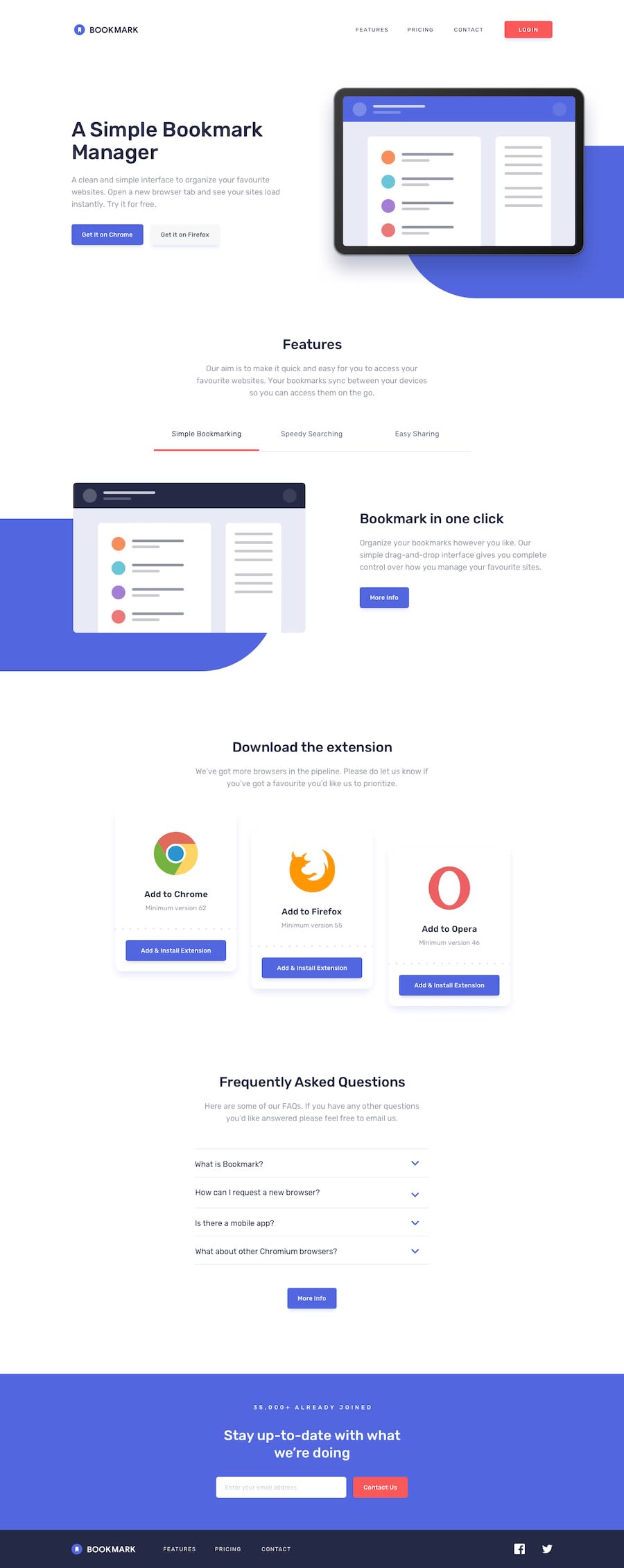
Design comparison
Community feedback
- @benjoquilarioPosted almost 3 years ago
Hi MiguelHG2351
Great job on finishing this one and It looks good and response rather well
Some concern about your accessibility and html issue.
- Document should have one main landmark. Your body tag should only contain these 3 landmark element. It will be better if the structure of your html page is like this, as you are using HTML5 syntax.
<header /> <main /> <footer />- You need h1-h6 to your
sectiontag. If you don't need one use the visually-hidden instead.
Some suggestion:
-
Change the alt attribute of your
.header-logo. "logo" is not descriptive, and since you wrap your image with anchor tag and it direct to home page maybe change alternative text to "Bookmark - home page". -
Instead of using <img> elements to wrapping your
.footer-social-mediayou should use anchor element<a>because this element is going to transfer user somewhere. Ex: <a href="#"> the image of social media </a> -
I don't think you need to add another div for your mobile menu you can manipulate it using JavaScript. I suggest you to delete those and try manipulating
.desktop-nav-containerinto mobile. You can do it😃.
Keep Coding and Goodluck
cheers, Benjo
Marked as helpful1 - @optimusprime202Posted almost 3 years ago
Hey @MiguelHG2351, You certainly did well today.
1
Please log in to post a comment
Log in with GitHubJoin our Discord community
Join thousands of Frontend Mentor community members taking the challenges, sharing resources, helping each other, and chatting about all things front-end!
Join our Discord
