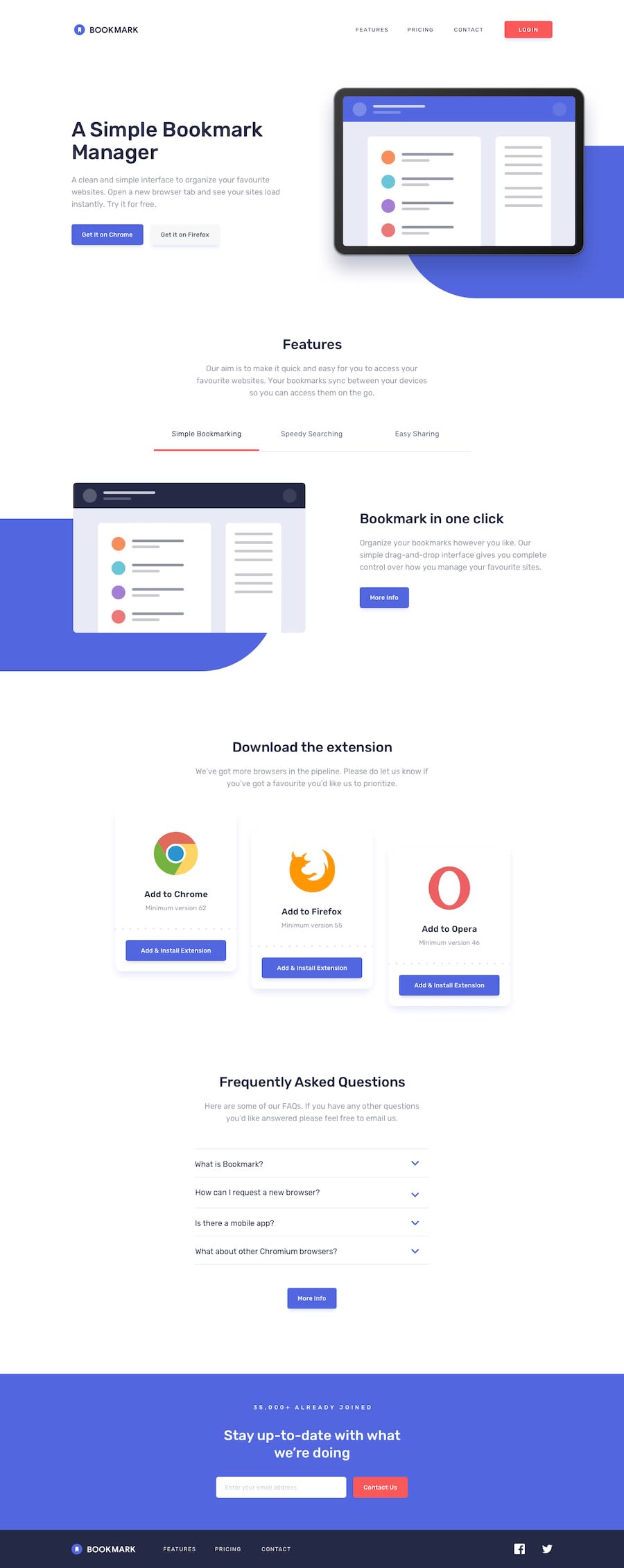
Bookmark Responsive Landing Page using React and TailwindCSS
Design comparison
Solution retrospective
I am very proud of the animations in the features section.
What challenges did you encounter, and how did you overcome them?Animating the features part was a bit difficult especially with the blue rounded div behind the pictures.
What specific areas of your project would you like help with?Anything regarding the animations and responsiveness or how to write cleaner react code or things like file structuring would be appreciated
Community feedback
- @robcrockPosted 3 months ago
The biggest things catching my attention on first glance is that the header image is a bit larger than the design and it's falling off of the right hand side of the screen.
I tried filling out the form at the bottom, but I don't get the error message I would expect.
I also noticed that several of the interactive elements aren't changing on hover as you would expect them to.
0@Deeperr0Posted 3 months ago@robcrock Thank you for the feedback. As for the header image the design seems to be like that on smaller screens so maybe that is the reason. I fixed the form. It was validating the email before using my function for handling the submit. Now it works fine I hope. As for the interactivity it is again part of the design that "More Info" buttons would not be interactive. If other elements are not interactive please let me know.
0@robcrockPosted 3 months ago@Deeperr0 maybe it was my screen resolution making the image look larger. Great job with the error message. As for the interactive elements, I was referring to many of the links should turn red when you hover over them.
0
Please log in to post a comment
Log in with GitHubJoin our Discord community
Join thousands of Frontend Mentor community members taking the challenges, sharing resources, helping each other, and chatting about all things front-end!
Join our Discord
