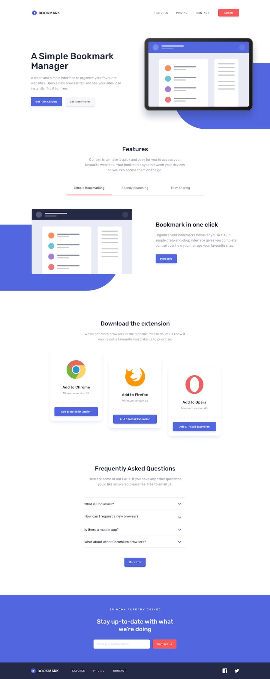
Design comparison
Solution retrospective
I started breaking down reusable elements from the start such as button, section, section title this did help me to style and build the site quicker however I have to admit that some of it was overkill for a static page.
additionally I had to change some styling elements because they did not pass the contrast test for acccessibility
What challenges did you encounter, and how did you overcome them?I kept trying to adjust the blue pill background with fixed css units, eventually found that percentages worked best
What specific areas of your project would you like help with?Any feed back :D
Join our Discord community
Join thousands of Frontend Mentor community members taking the challenges, sharing resources, helping each other, and chatting about all things front-end!
Join our Discord
