Design comparison
Solution retrospective
feedback please my friends..
Community feedback
- @nikolovlazarPosted almost 4 years ago
Hi Irfan! 👋
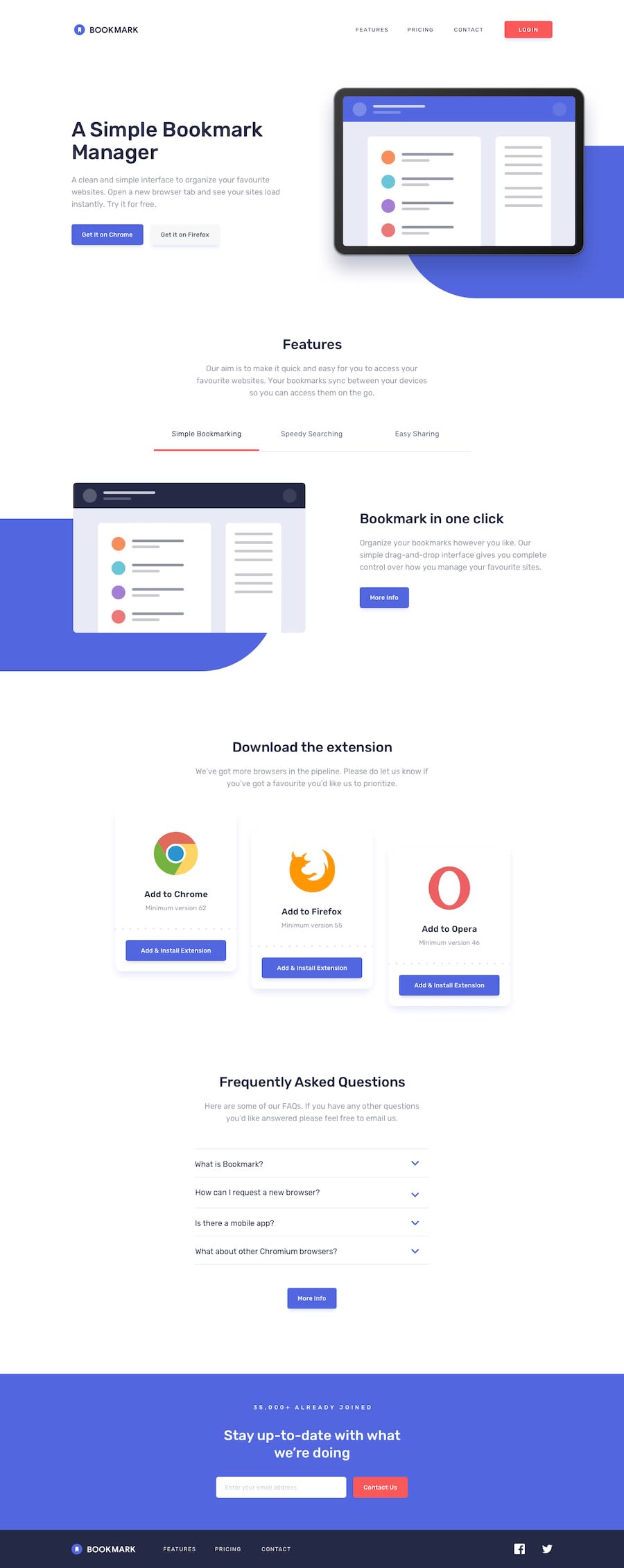
Your solution looks really good! I noticed the navbar items are not capitalized. You can achieve that by setting
text-transform: uppercase;to them. Also, keep an eye on the color. I noticed some of the text you have in your solution is painted with a different color than the design. The colors might look the same, but it affects the overall design of the website. You can use a simple Color Picker to discover even the slightest color differences. As for the "Download extension" section, try addingmargin-topto the elements to achieve that effect.All in all, good job! Keep up the great work! 🙌
1
Please log in to post a comment
Log in with GitHubJoin our Discord community
Join thousands of Frontend Mentor community members taking the challenges, sharing resources, helping each other, and chatting about all things front-end!
Join our Discord
