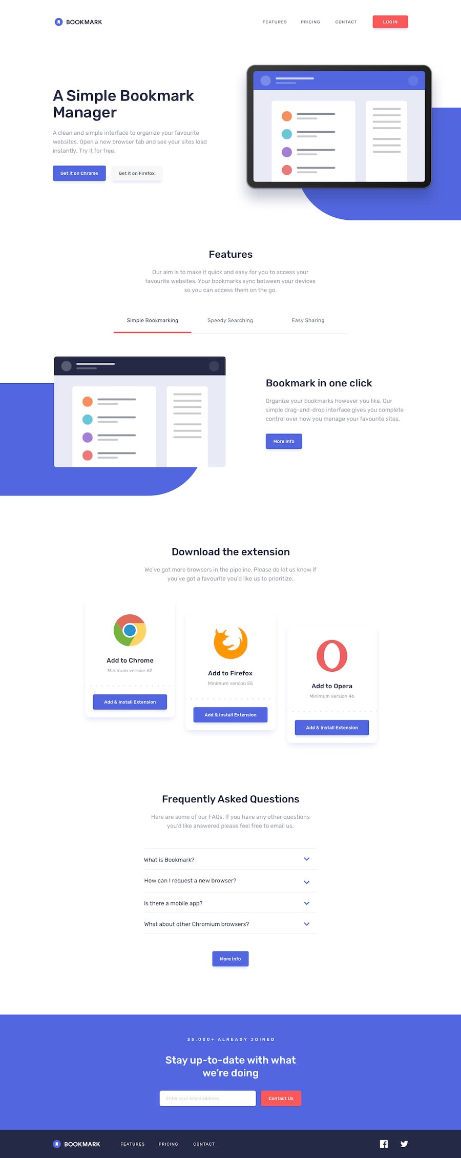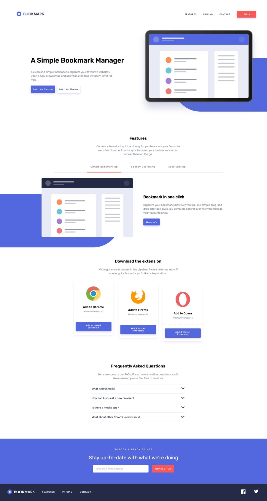
Design comparison
Solution retrospective
This is my first time developing in React so it's incredibly messy in there. This project is something I'll be coming back to to clean up as I learn more about this JS Library.
But if you have any advices you could throw at me I would greatly appreciate it!
Community feedback
- @mattstuddertPosted about 5 years ago
Hey Tiffany, it's nice to see you using this project to dive into React. As Phut mentioned, the live preview link currently isn't working so I can't see what you've built.
But I did take a look at your code and here are a few suggestions:
- For the hamburger toggle, you're grabbing each line individually and changing a class to make them animate. A simpler way of doing this would be to just add that class on the
button
itself and then animate the child elements based on the parent having/not having a class. - Instead of using state on class components, I'd recommend having a look into using Hooks. They actually clean up the code quite considerably!
- For purely presentational components, using functional components instead of class components will remove some code.
- Be sure not to forget about using semantic HTML5 structural elements like
section
andheader
. It's easy to revert to just usingdiv
elements when you start out using a component-based architecture, but they're still very important elements to use.
I hope these pointers help. Keep up the great work and I'm looking forward to seeing your next solution! š
1@yiranoPosted about 5 years agoOh how embarrassing! I didn't know I had to push directly into the main branch and had pushed into the gh-pages after a slight modification to the code.
Thank you for these suggestions! I'm going to implement these changes now. :D
0@mattstuddertPosted about 5 years ago@yirano haha, it's an easy mistake to make. Now that I can see the site, it looks awesome. Great work!
0 - For the hamburger toggle, you're grabbing each line individually and changing a class to make them animate. A simpler way of doing this would be to just add that class on the
- @phut-tranPosted about 5 years ago
Hi @yirano, I couldn't see your live preview site. You may have a duplicate link in your submit solution.
1@yiranoPosted about 5 years agoHi tdphut! Thank you for pointing this out. I had pushed directly into the gh-pages after making a slight change instead of pushing it to the main. I corrected the error so it should be working now!
0 - @MasterDev333Posted almost 4 years ago
Hi, it's amazing. Great work so far. It would be great if you add some transitions on element. Then you can get smooth effects when you hover button and accordion. Anyway, it's perfect. :)
0
Please log in to post a comment
Log in with GitHubJoin our Discord community
Join thousands of Frontend Mentor community members taking the challenges, sharing resources, helping each other, and chatting about all things front-end!
Join our Discord